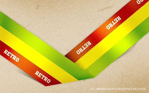
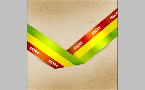
Are you interesting in retro style? I have one interesting tutorial for you how to make a retro style ribbon by yourself.
Start by making a new document in Photoshop – around 500×500 pixels in size, or, you know, whatever you prefer and fill it with color of #dac8aa.
Now, find some appropriate texture to put it on the canvas. You can find a lot of interesting textures or feel free to use mine. Open this texture and copy to the canvas. Then desaturate it with Image > Adjustments > Desaturate:
After that change layer mode to Overlay and change opacity to 60%. Merge two of layers in one.
Ok, now I would like to sharpen of background. Use the Sharpen Tool to do this.
Ok, now we start to create the ribbon. First of all, get out the Rectangular Marquee Tool to create selection as on my picture below and fill in with green (#95b900) color on the new layer.
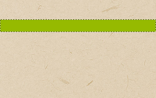
Add two more lines in the same way using yellow (#e9db03) and red (#b94a00) colors.
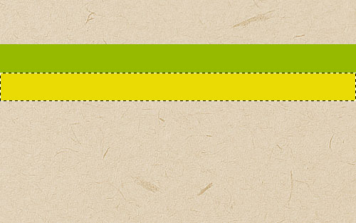
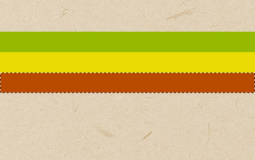
Remove the selection with Ctrl+D and duplicate layer using Ctrl+J, then use Ctrl+T to rotate copied layer as you can see below.
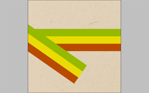
Also move to the original layer and rotate it to.
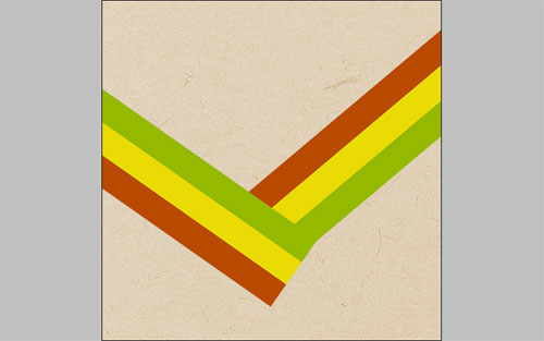
Now, select this layer with Select > Load Selection and drag with black to transparent gradient. It will be the shadow from upper part of the ribbon.
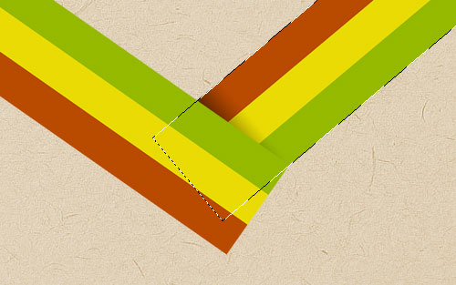
Remove the selection with Ctrl+D and merge two of these layers in one. After that get out the Polygonal Lasso Tool and select some part of ribbon in the bottom. Press Delete to clear selected part of image and remove the selection again.
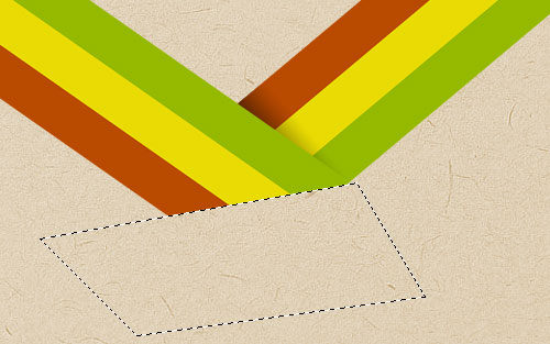
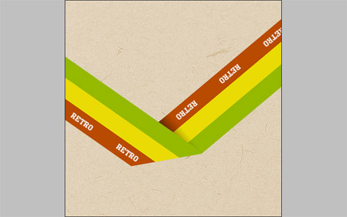
I think, time to add the text our ribbon, give it some life, right? Get the Horizontal Type Tool out and write some text onto your ribbon. In the bottom image I’ve used a_MonumentoTitul for my font, if you don’t have this font just find a good another one. I also used the color of #efe6e0. After that rotate the text with Edit > Free Transform on the ribbon and duplicate four more times.
Then merge all text layers and ribbon layer in one and apply the Outer Glow layer style for this layer.
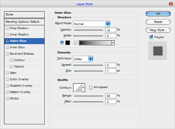
Now you should have something like this:
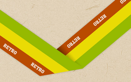
Apply Filter > Texture > Texturizer for this layer:
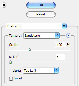
Now, we have a relief like this:

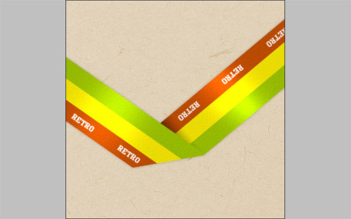
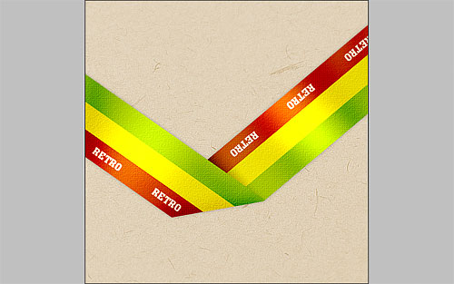
Then, move to the next step. To bring our ribbon three-dimensional effect use Dodge Tool with moderate settings (Brush: 125 px, Range: Highlights, Exposure: 20%) and do a little bit of dodge-work on it. We should have an image like below:
Select Burn Tool (Brush: 80 px, Range: Shadows, Exposure: 30%) to make some burn-work.
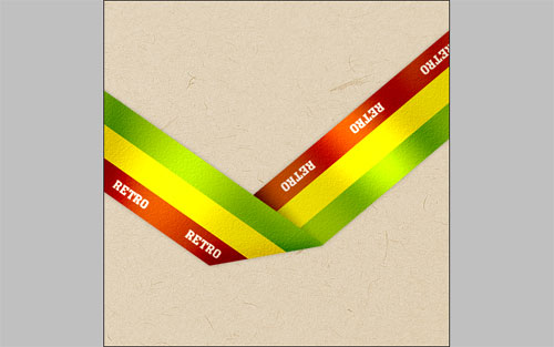
Move to the next step. We need to add the grid to ribbon. Create a new document with size of 3×3 pixels and draw the pattern by using Pencil Tool as on picture below.
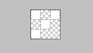
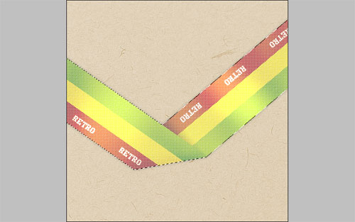
Then go to Edit > Define Pattern and save it as pattern. After that go back to our main document, use Select > Load Selection to select ribbon area, then create a new layer, get out the Paint Bucket Tool and fill selected area with new pattern.
Remove selection with Ctrl+D and mess a little bit with layer mode and opacity. I tried Overlay and 40%.
Now, it will be better to add a shadow to the places where the arrows indicates.
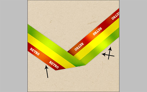
Create a new layer under the layer with ribbon. Get out the Polygonal Lasso Tool to create selection as on my picture below and fill it with black to transparent gradient.

Remove selection using Select > Deselect and blur the shadow a little bit with the Blur Tool.

Add more shadow to other two places in he same way.
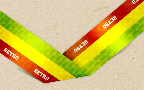
Looking quite good now. To finish off this tutorial, I think, we need to add some shadow to the background. Go to the background layer, select the Burn Tool (Brush: 300 px, Range: Shadows, Exposure: 30%) and make darker some parts of the background.
That is it for now! Our tutorial is done!

