In this Photoshop tutorial I’m going to be teaching you how to design a somewhat realistic (sort of cartoon-themed) ribbon in Photoshop! I’m sure if you read this tutorial carefully, even the beginners will be able to understand and follow through until the end result.
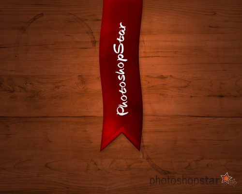
This is what we will be designing in this tutorial:
1. Getting Started
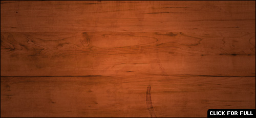
Let’s start by creating a new document in Photoshop. I’ll be using a small size of 500 x 400 pixels, since this won’t be for print I don’t need to make it huge! After creating a document in Photoshop, create a nice, suitable background. I’ll be blending a couple of different wood textures together that I found on a free texture website. Here is a small list of places where you can get good textures from:
How’s that look? In my opinion, DeviantART is probably the best, since it has a very large selection of textures, not just wood textures.
In the above image I’ve applied Filter > Render > Lightings effects with an Omni light type, to give it a little more interest. 🙂 Happy with your background? I hope so! Let’s move onto the next step.
2. Create the Ribbon Shape
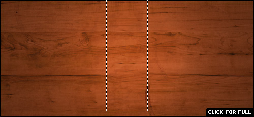
Ok, let’s start on the shape. What you might want to do before getting started is enabling the grid (View > Show > Grid) then modify the settings for it, (Edit > Preferences > Guides, Grids & Slices…) I recommend changing gridline to every 10 pixels with just 1 subdivision. Alright, make the shape. Get the Rectangular Marquee Tool out and make a long selection from the top to the lower middle area.
Fill your selection with a dark-red gradient then deselect. The colors that I’ve used for my gradient are #9a0c03 to #6c0a00. After you’ve filled your selection with a gradient, make another triangular selection at the bottom of your ribbon, this will be the cut part. Making your selection will be easier if you have the grid enabled.
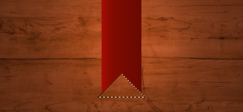
Obviously after making your selection you should press delete to remove the selected area.
3. Apply Effects to Ribbon
Let’s make it a little more interested now. Start by adding some layer styles, (right-click your layer in the layer’s palette and go into the Blending Options.) you can see what I’ve used in the list below:
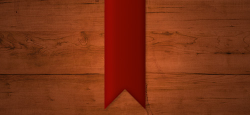
Do you like the look of it so far? Let’s add a couple more effects to it anywho. Find and get out the Burn Tool, and set the settings to Shadows, 10%. Brush lightly over your ribbon to give it a little more effect. Afterwards, get out the Dodge Tool and set the settings to Highlights and 50%. Repeat what you did with the burn tool, but in different places to give it more depth.
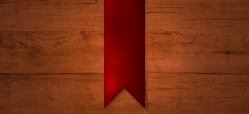
Looks a bit better now, right? 🙂 We’re just about done here, but I think we need to add a few finishing touches!
4. Add Highlight/Shadow Effects & Text
If you want to add a bit of texture to your ribbon, you can do so by following these steps:
- Create a new layer, reset your colors to black and white (press D) then apply Filter > Render > Clouds.
- Apply Filter > Sketch > Chrome to your clouds layer, then select your ribbon pixels (hold ctrl and click the thumbnail for your ribbon layer.)
- Invert your selection and press delete, this will leave your chrome texture inside of the ribbon.
- Change the layer mode for your layer to Multiply and lower the opacity to around 20-30%.
This is what I came out with:
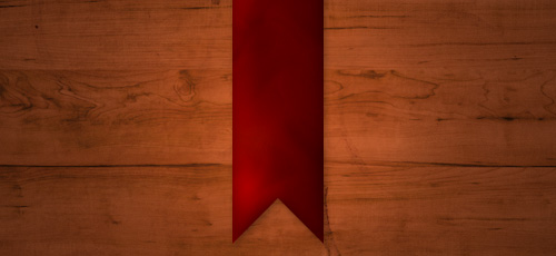
If yours didn’t come out very well, then you don’t have to worry about it–the dodging and burning should be sufficient. After doing all of this, we can add some nice glossy-style highlights to the banner, but this is all optional.
Start by selecting your banners pixels (hold ctrl and click the layer’s thumbnail) then create a new layer. After creating a new layer, contract your selection by about 2 pixels (Select > Modify > Contract) then move it up about ten pixels (an easy way to move your selection up by 10 pixels is by holding shift and pressing the up key once.)
Fill your new selection with a very dark gradient (black to transparent gradient) then change the layer mode to either Overlay or Soft Light, and lower the opacity to around 20-40%.
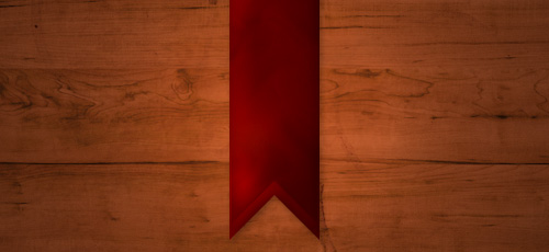
Duplicate your shadow layer, invert it (ctrl+I) and move it back down around 8-10 pixels.
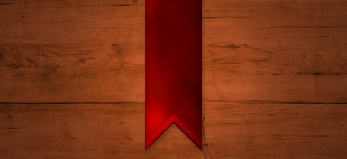
Cool effect? Yes? No? Maybe?
Alright, we have to finish off this step by adding text, so let’s do it! Get out the Horizontal Type Tool and write out your text horizontally… as the tool states.
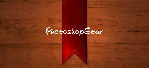
Ok, now rotate your text 90 degrees CCW and move it into place. I finished off by applying a simple drop shadow layer style.
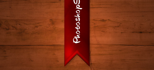
5. Finishing Touches
For the finishing touches I applied a distort filter to the overall ribbon/banner, then merged the whole thing and applied a few light filter effects.
If you want to distort your banner’s shape, then follow these easy steps:
- Firstly you’ll have to merge all of your ribbon layers together, do this by putting them all in a group, then selecting the group and pressing CTRL+G.
- After merging, go to Filter > Distort > Wave or another filter of your choice. For the Wave distort filter, you will have to mess around with the settings to get an effect that is pleasing.
Now to finish off, a few simple layer styles:
- Filter > Render > Lighting Effects
- Edit > Fade Lighting Effects > 40%
- Filter > Sharpen > Sharpen
- Edit > Fade Sharpen > 30%
How’s yours looking?

I hope you enjoyed this tutorial! Please leave a comment if you need help or anything of the sort.

