This is a relatively basic Photoshop tutorial, but you should have basic knowledge of Photoshop and its tools to follow through to the end.
We’ll be learning how to design these glossy “Web 2.0” badges in Photoshop. We’ll start off making the shape then styling it using layer styles and additional separate glossy layers.

1. Set up a New Document
Start by creating a new document in Photoshop; for this tutorial I’m going to be using a 400 x 400 document. After you’ve created a new document, design a nice background for your canvas; I used a light blue gradient and some simple white scan lines.

2. Making the Shape
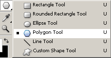
Now let’s make the shape of the badge – in your Photoshop Tools Menu, find and get the Polygon Tool (U).

Be sure that your settings are set up correctly near the top of Photoshop:
![]()
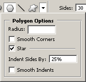
Click the drop down arrow that is highlighted in the above image and use these settings:

Now you’re pretty much set to create the shape, although you might want to change some of the settings so that it will be more suited to your tastes. Create a new layer (layer > new > layer) then drag your shape onto the canvas. The color I’ve used for my shape is #4fb2ea.
You should have a badge something like this one:

Well, that’s how to make the basic shape, now move onto the next step to make it look a little nicer 😉
3. Slight Effect (Layer Styles)
In your layers palette, you’ll want to right-click your badge layer and go into the Blending Options. Click and apply the following layer styles/settings:
You should now have something like this:

Looking a fair bit better now. Next thing to do is add some gloss and highlights!
4. Highlights
Create a new layer then select the badge pixels by holding ctrl and clicking the layer thumbnail (in the layer’s palette).

Contract your newly-made selection by about 2 pixels by going to select > modify > contract and using an input that you think fits.

Again in a new layer, fill your selection with white (#ffffff), press the down and left arrow keys once each, finally press the delete key on your keyboard then you should be left with something like this:

Next, change the layer mode for this layer to Overlay and lower the opacity if you think necessary. I lowered mine to around 70%.
Make the selection around the badge layer again and contract the selection again by 2 pixels (or whatever amount you used before), on another new layer make a White to Transparent gradient from the top left to the middle area like so:

Find and get out the Polygonal Lasso Tool and use it to make a diagonal selection from the bottom left to the top right somewhere, then delete your selection like shown below:

Change the layer mode for this layer to either Soft Light or Overlay, and lower the opacity to around 30-70%. Now you should have a nice result like this:

5. Finalizing
Looking much nicer now! Finally, you may want to add some text onto your badge, such as ‘Beta’ as the joke goes 😉
I simply added the word “Web 2.0” onto my badge, using a simple font such as Arial. If you use white as your text color, you may want to add a blue drop shadow to your text layer.

Complete + PSD
Thanks very much for reading this tutorial! I hope you enjoyed it.
