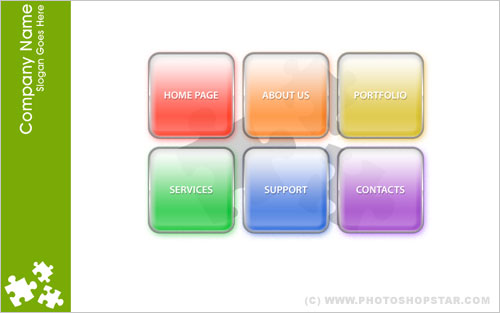
In this lesson I will show you how to create an excellent navigation bar (menu) for your website, which you may use further as finished design.
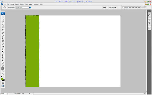
In the beginning let’s create a background, on which we will put our menu bar. Create a new document with size of 800×600 px and fill it with white colour.
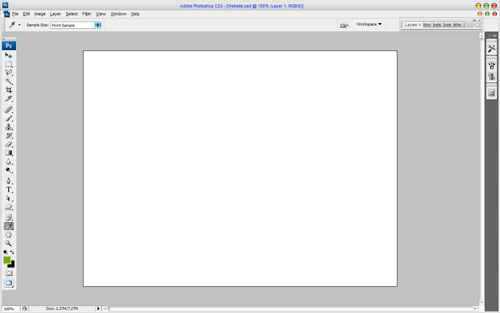
Then make selection with Rectangular Marquee Tool and fill selected area with colour of #78b000.
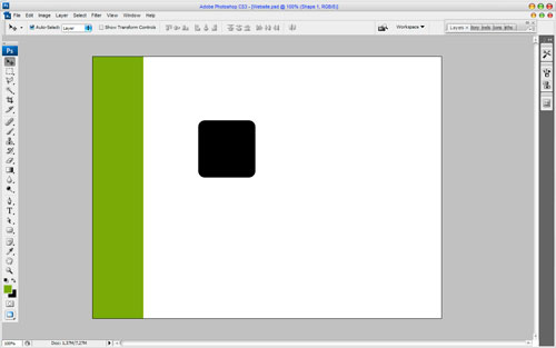
Remove selection with Ctrl+D. At this point we start to create menu bar. Select the Rounded Rectangle Tool (Radius: 15px) and make some form with any colour:
Set opacity fill up to 0% for this layer and apply following Blending Options for current layer:
• Drop Shadow
• Inner Shadow
• Outer Glow
• Inner Glow
• Bevel and Emboss
• Gradient Overlay
• Satin
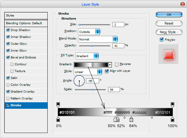
• Stroke
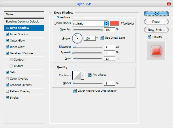
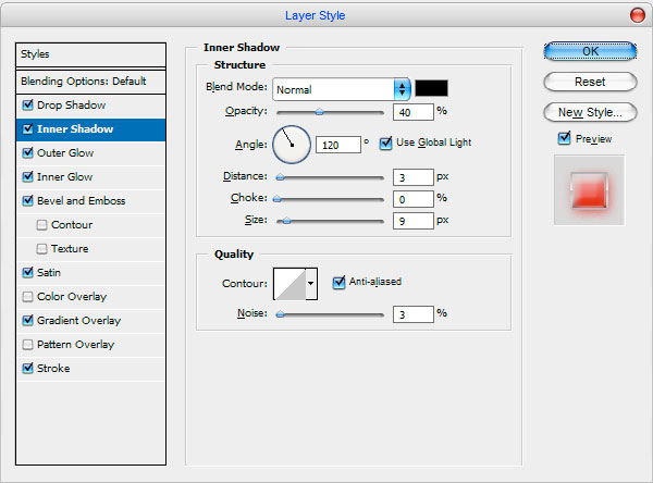
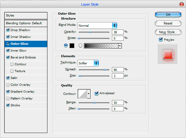
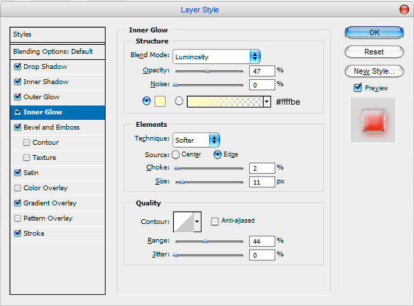
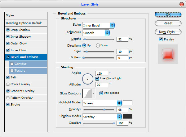
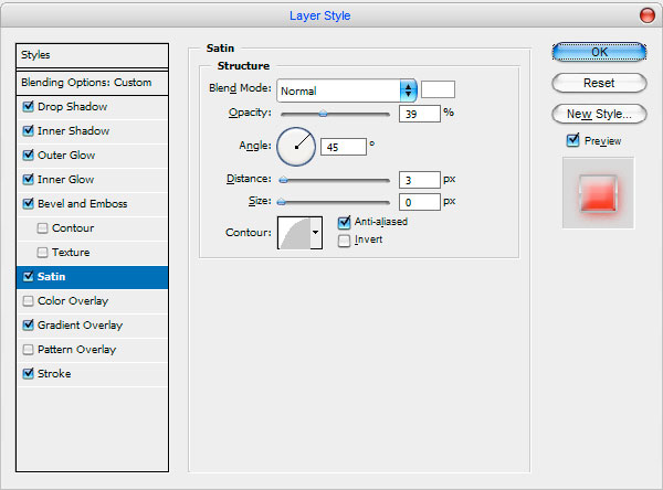
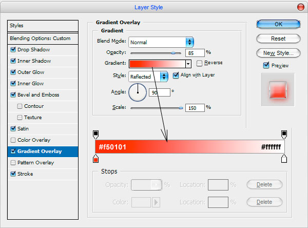
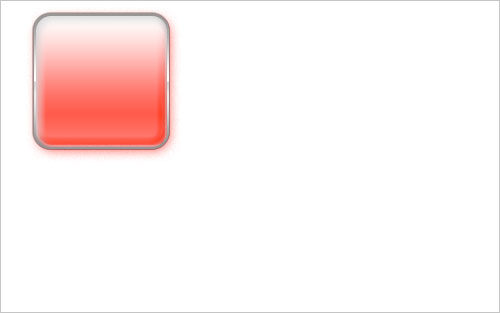
As the result we have got the following button:
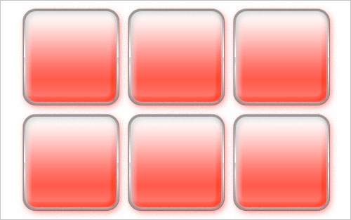
Now duplicate it five more times and locate as it shown at the picture bellow:
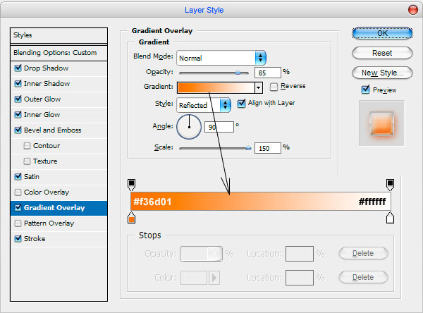
Now, we need to make these buttons coloured. To do this change some Blending Options for each button:
For second button:
• Drop Shadow
• Gradient Overlay

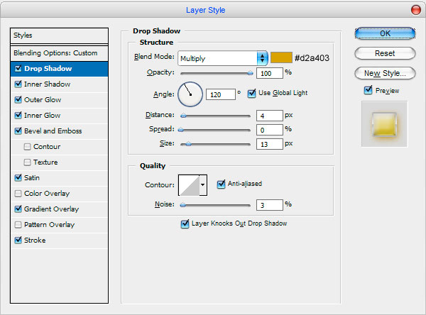
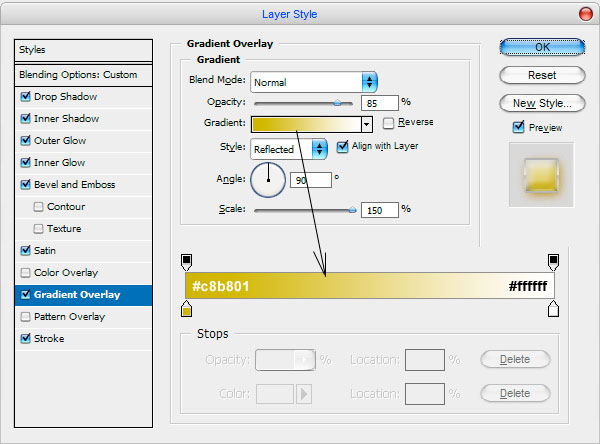
For third button:
• Drop Shadow
• Gradient Overlay
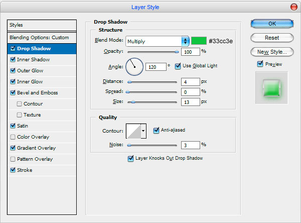
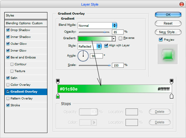
For fourth button:
• Drop Shadow
• Gradient Overlay
For fifth button:
• Drop Shadow
• Gradient Overlay
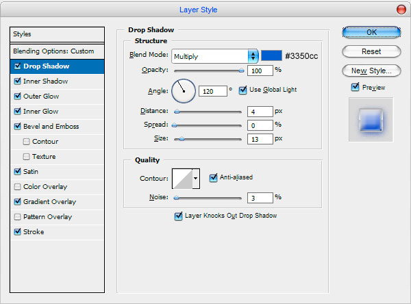
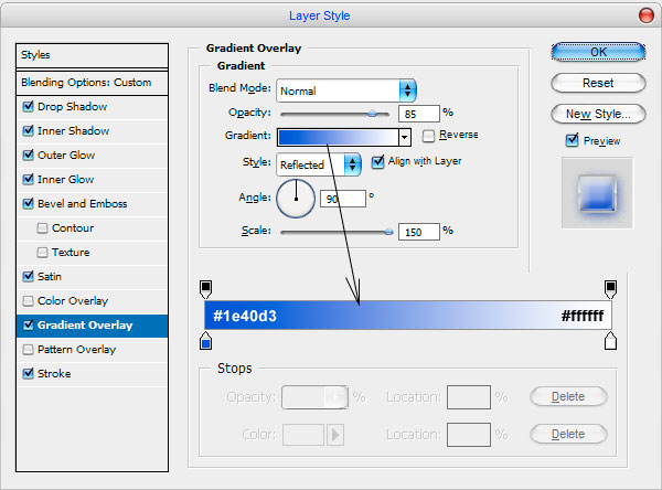
For sixth button:
• Drop Shadow
• Gradient Overlay
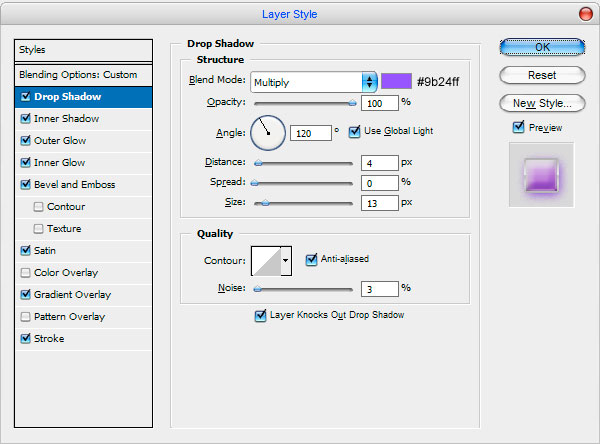
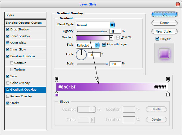
We have got the following result for each button:

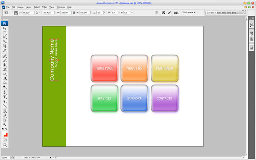
After that we need to add the text to each button. Get out the Horizontal Type Tool and type the title for one button with white colour and using the Myraid Pro font. Try to get the same result as it’s shown on my picture bellow.
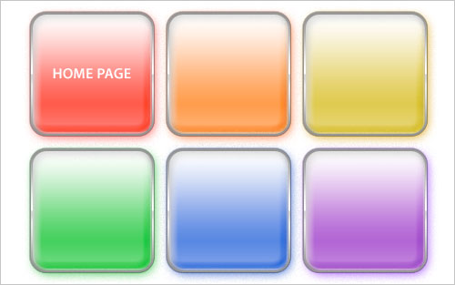
Then apply the following Blending Options to this text layer:
• Drop Shadow
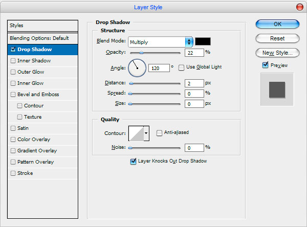
Get a shadow from the text.

After that copy text layer five more times using Ctrl+J and locate copied layers above all buttons. For each button type own title as on picture below:
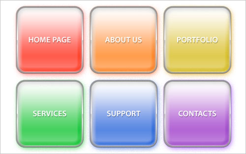
At this point we finished our menu. Now, I think, we should add the logo to finish off the site design.
Select the Horizontal Type Tool and write out the name and company slogan with white colour and using the AvantGarde Md BT font.
Time to add the logo. Select the Custom Shape Tool and choose the standard form from the palette:
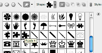
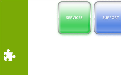
And now draw the puzzle in the left bottom corner of canvas:
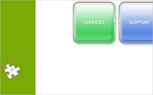
Now, rotate it a little bit using Ctrl+T:
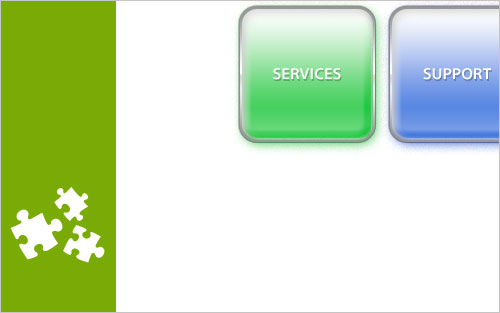
Add a few shapes to our logo in the same way:
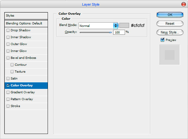
And the last step we need to do is add barely perceptible logo to the background behind the buttons. Copy three of layers with puzzle and apply the following Blending Options to each of copied layer:
• Color Overlay
Now, you get something like this:
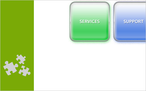
After this move all grey copies of puzzle under layers with menu and proportionally increase to the following size like on picture below:
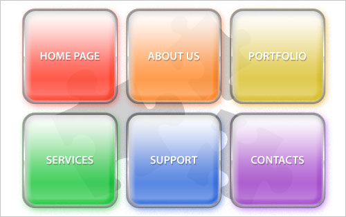
You will not lose the quality while increasing because all of these shapes are vectorial. Our lesson is over now. We have got excellent corporative design, haven’t we?

