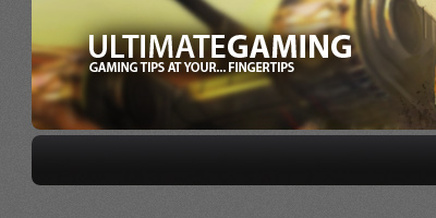
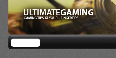
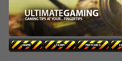
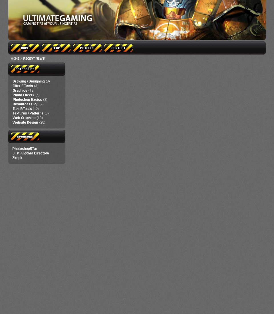
I know I’ve already (somewhat recently) done a tutorial on a designing a clan/gaming template, but this is one looks completely different, and of course I just love designing clan templates! So, in this easy step-by-step tutorial, I’m going to be showing you how to design a somewhat professional, clan-gaming website template. You can see the preview below.
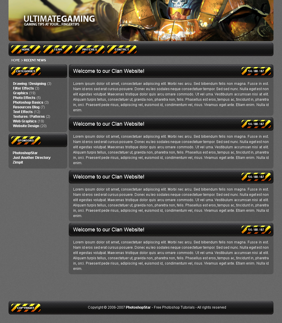
(what we’ll be designing – click for larger)
1. New Document, Create Background
Alright, let’s start by creating a new document in Photoshop, in which we can design our website template. I’ve used a document sized 960 x 1100 pixels, since most people browsing a clan website won’t really be using the 800 x 600 resolution. After creating your document, fill the background with a nice mid-grey color, (in this case I used #6c6c6c).
After filling your background with a solid color, you can give it a bit of texture by applying a pattern of some sort, or simply applying Filter > Noise > Add Noise with an amount of about 2.0.

View a small article I wrote about pattern resources here.
2. Design the Header/Banner
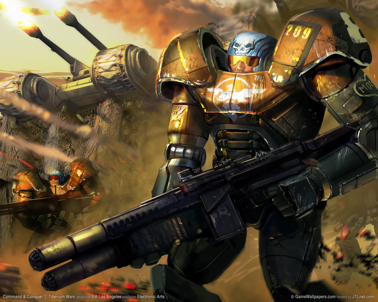
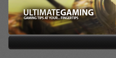
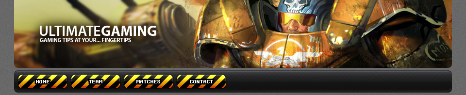
Alright, now we need to make a header. Start by finding a screenshot or some renders from the game your clan plays, or if you’re just designing this for the sake of … designing, then how about you just use this wallpaper of Command and Conquer 3 Tiberium Wars. Copy the wallpaper onto your canvas and crop it to a suitable banner size. I also made the corners for my banner rounded.
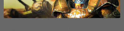
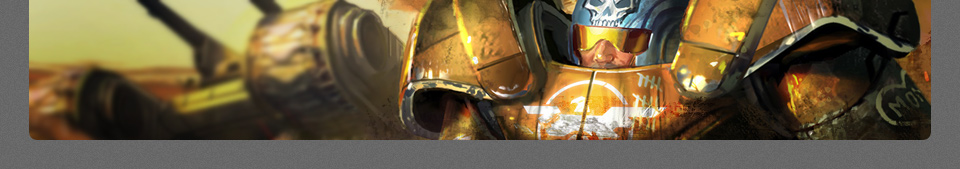
In the above image you may notice that it looks like I’ve touched the image up a little bit, well, I did. You can too by using the Burn Tool to darken up a few areas, then the Blur Tool to blur some of the background action.
I finished up the banner by adding in some grunge brushing to give nice detail. You can download the grunge brushes that I used from Misprinted Type. When adding in your grunge brushing, use very dark brown colors that you can sample from the wallpaper you’ve used for the banner.
(click for larger)
Let’s finish up with the header by adding in your clan name/description/slogan/whatever. Start by getting out the Horizontal Type Tool (the regular text tool, of course) then writing out your clan name in a size about 30 pt, then write out what your clan is, or your description underneath. This is what I managed to get using the font Myriad Pro:
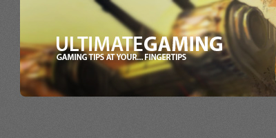
Need free fonts? Try UrbanFonts.com. Looking good so far, but the text isn’t very easily readable. You can fix this problem by doing a little bit of soft brushing on a layer underneath the text layer. I used a couple of dark browns, with varying opacities.
Alright, we’re pretty much done for the header, what do you think? Feel free to add in some extras if you can think of any!
3. Navigation Bar & Buttons
Start by making a new layer. Now find and get out the Rounded Rectangle Tool, it’s with the Custom Shape Tool somewhere.
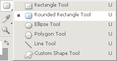
Set up the settings for this tool as shown below:
![]()
Now, in your new layer, draw a rounded rectangle onto your canvas, this will be the main navigation bar. If you need to you can use the Rounded Rectangle Tool to clean up the bar a little bit, such as if you need to make it wider or thinner.
Now, you need to lock the transparent pixels for your navigation bar – you can do this in the layer’s palette, don’t worry, there’s a screenshot below 🙂 After locking the transparent pixels, get out the gradient tool and set it to a very dark gradient (colors used: #131212 & #3c3c42), after getting your gradient ready, you can drag the gradient inside of your navigation bar and it will only fill the pixels. You can unlock your layer now.
![]()
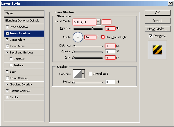
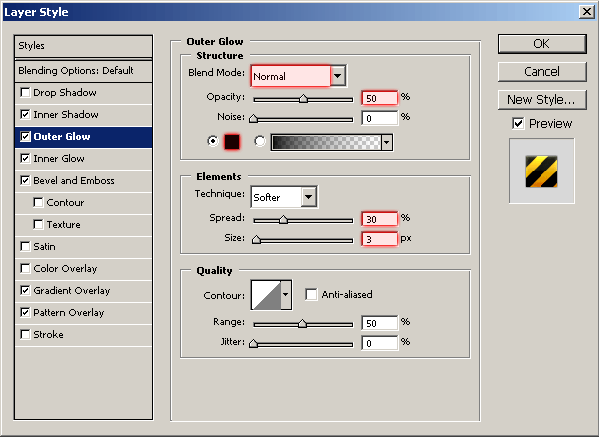
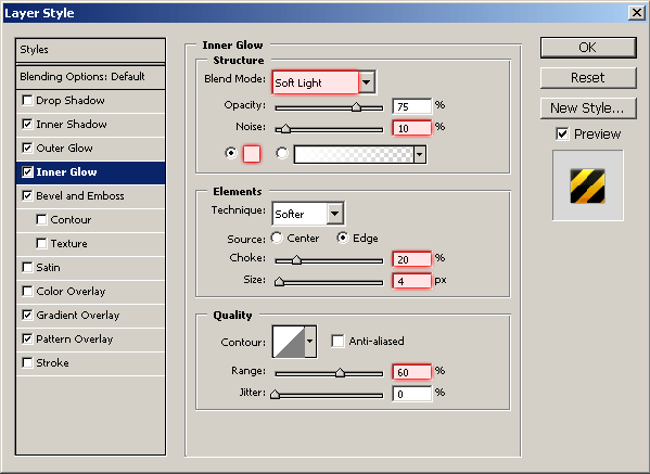
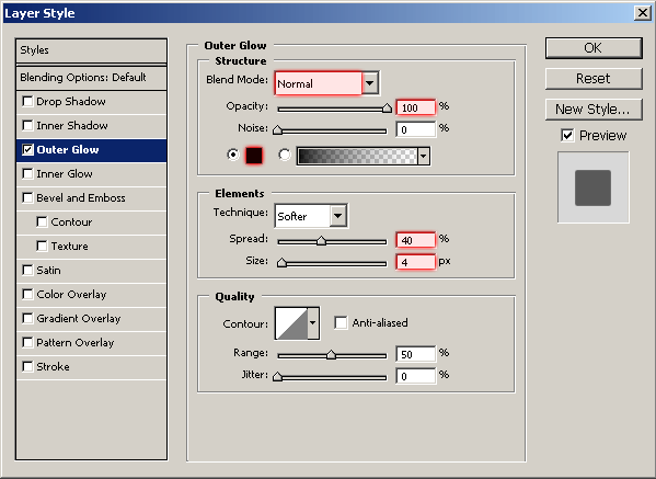
After all of this, it’s time to apply some layer styles to the navigation bar. I used the following:
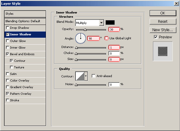
Your navigation bar should now look pretty much like this:
Looking good, but could do with a few nice touchups. Start by creating a new layer, then selecting your navigation bar pixels (hold ctrl and click the layer’s thumbnail) after selecting the navigation bar, contract the selection by one pixel. After doing this, draw a white to transparent gradient inside of the selection.
Change the layer mode for this layer to either Overlay or Soft Light, and you might need to lower the opacity, depending on how strong your gradient was.
Again, select your main navigation bar, but this time you don’t need to contract the selection. In a new layer, draw white to transparent gradient from the top to the bottom of your selection. Now, cut your gradient in half (my navigation bar was 46 pixels in height, so I cut the bottom 23 pixels off)
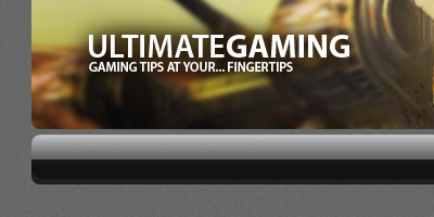
Again with the layer modes/opacities! I changed the layer mode for this layer to Soft Light and lowered the opacity to 20-40%. Alright, the navigation bar is complete, now it’s time for some buttons.
Get the Rounded Rectangle Tool out again and make a smaller, button-sized shape (be sure you’re on a new layer!)
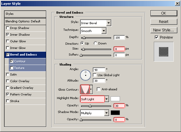
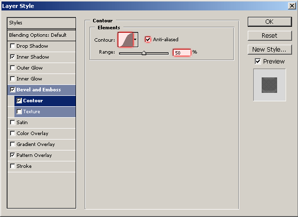
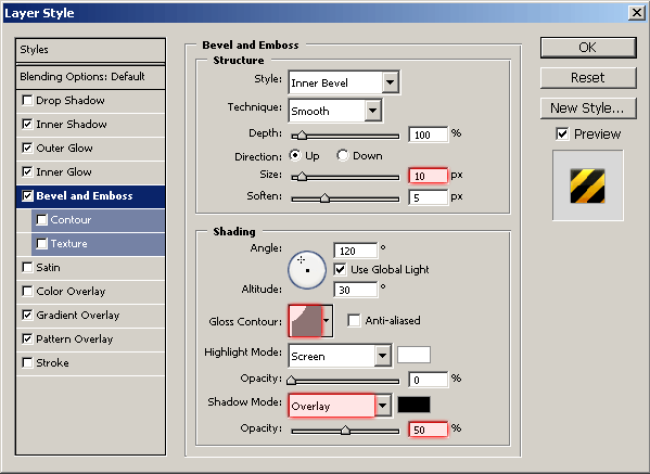
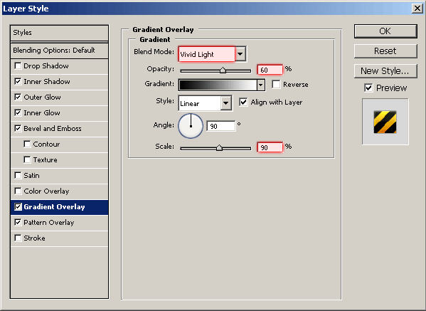
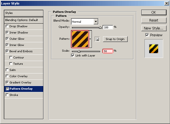
Looking pretty good so far, time for some layer styles…again! Apply the following layer styles to your new button layer:
- Inner Shadow
- Outer Glow
- Inner Glow
- Bevel and Emboss
- Gradient Overlay
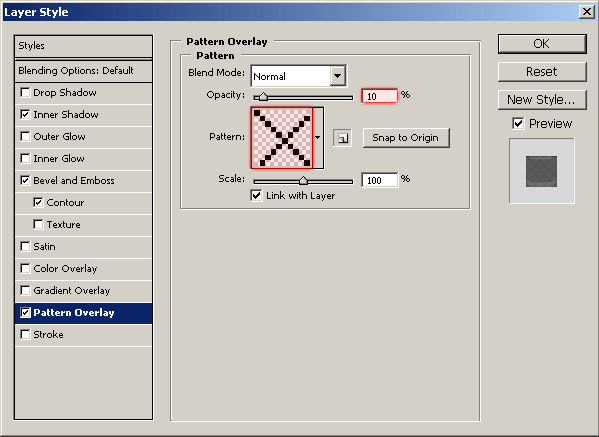
- Pattern Overlay (download warning tape pattern)
And now your button should look pretty much like this one:
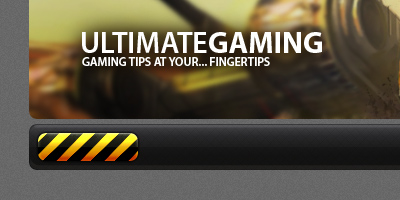
Pretty nice, eh? 🙂 You can finish this step off by simply adding text to the button, duplicating both layers and moving them overlay, etc.
The font I’ve used in the above image is a free font called “PF Ronda Seven”, and you can download it for free from DaFont. I also applied this Outer Glow to each of the text layers.
View the complete design so far.
4. Categories/Sidebar Section
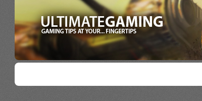
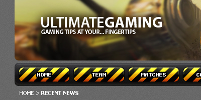
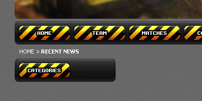
Before we do the categories/sidebar section, add in ‘Home > Recent News’ underneath the navigation bar, using a font such as Tahoma or Arial, and a really small size (11 pt), this is what I came up with:
Alright, now it’s time to make the categories section. For this you can either just remake the navigation bar, but this time make it shorter in width (200 pixels) or you can duplicate the original navigation bar layers and just cut them down. It would probably be best if you just created another bar using the Rounded Rectangle Tool, then copied all of the layer styles and effects over.
You want to come up with something like this:
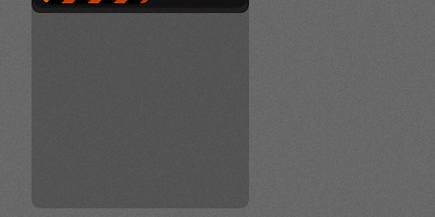
After making the bar, you want to make a container kind of area for the links and stuff, so duplicate your main bar layer, move it underneath the layer then fill it with black. Move your duplicate layer down about 160 pixels or so, then stretch it upwards, as shown in the below image.
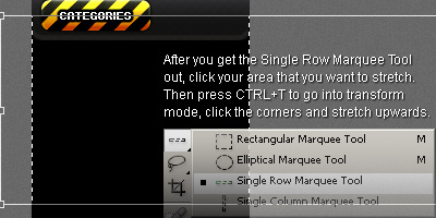
Hopefully the above image explained to you what you need to do to make our categories container area. If not, I’m sorry I couldn’t explain it any better, but if you have any questions please feel free to leave a comment!
After making your container area, lower the opacity for the layer to about 20%.
Now it’s time to populate your categories container with … well, categories. I simply copied/pasted the categories from my website here, but you might want to do something else with this sidebar section.
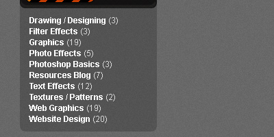
What you’ll want to do now is duplicate all of these layers, move them down and simply change the text layers. Some good examples are: Sponsors; Recent Matches; Member List.
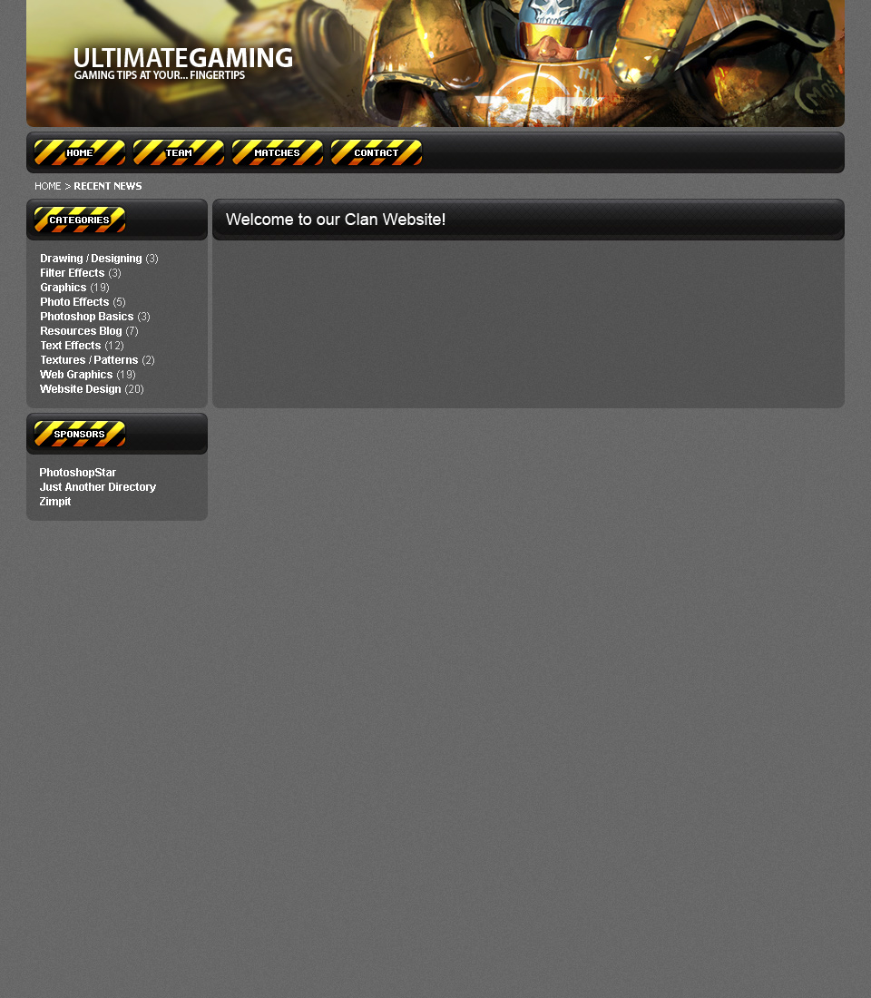
View the complete design so far.
5. Content/News Updates Area
For the news/content area, you could simply copy the navigation bar or sidebar section over and change a few things around (stretch to fit), which you can do if you want, but I think the updates area needs a little bit more distinction from the rest of the template.
I did end up duplicating the sidebar section and moving it over, I then stretched it to the correct size and changed a few layer styles to make it look a little bit different.
- Bevel and Emboss size: from 8 to 11.
- Pattern Overlay opacity: from 10 to 20.
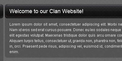
You want to come up with something like this:
(click for fullsize)
The font I’ve used in the above image is Arial, size 18 pt. You might want to use something a bit bigger than this, maybe even a different font (try Georgia)
Fill out your updates area with some dummy text. Go to www.lipsum.com for the official ‘lorem ipsum’ dummy text.
I just thought of this actually, you could also add a little bit of grunge to each of your heading bars, it would be a nice touch.
6. Finishing the Design
Well, to finish up this design, I think you’ll need to make a footer area, and just generally touch up the rest of the template, add in some extra features if you can think of anything, but you’ve pretty much done with the general/basic design.
Maybe add some Google Ads into your design? 😉 Probably not the best practise for a clan website template.
Well, thank you for reading this tutorial everyone! I hope you enjoyed it and learned a thing or two.