In this quick Photoshop tutorial we’ll be learning how to design a set of really cool, war-style game navigation buttons 🙂

1.
First off start by making a new document and filling the background with a very dark color. For this tutorial I used a document size of 400 x 400 pixels, and a background color of #0e0b06.
Make a new layer and then get the Rectangular Marquee Tool, set the mode to Fixed Size, use the dimensions 100 px by 1 px
![]()
2.
On the new layer make the selection and fill it with a light yellowish orange color. (#e39206)

Duplicate the line layerand move it down around 15-20 pixels downwards. Merge the two layers together.

Apply Filter > Blur > Motion Blur with a ratio of 100 to get this look:

3.
Apply these layer styles to the lines layer:
(download the pattern from here)
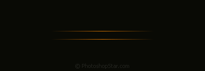
Make a new layer and leave it empty, select the two layers (new layer and the lines layer) and merge them together.
4.
Again, make a new layer and with the selection tool make a selection in between the two orange lines. Since my two lines are 15 pixels apart, my selection in between the two will be 13 pixels in height.
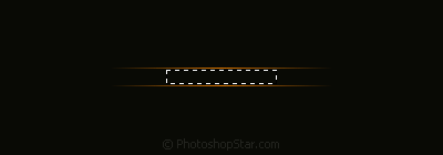
Fill the selection with #115272.
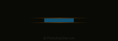
Apply Motion Blur to the layer again then apply the same layer styles as before. (use lower opacities when applying the layer styles though)
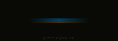
Make a new layer and merge the new layer and blue box layer together like last time, now use a grunge brush to erase a few bits of both the orange lines and the blue part.
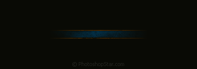
Looks much better with erased bits, huh? 🙂
5.
For the text I used
- Font: Tahoma
- Size: 11 pt
- Anti Aliasing: None
- Color: #dc8e06
I then applied these few layer styles to the text layer:
This is what we have now:
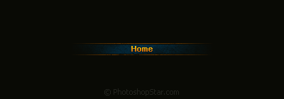
Duplicate your button and text layer(s), move them down, change the text, repeat. This is what I finished with:

Thanks for visiting PhotoshopStar, everyone, I hope you enjoyed the tutorial. I know I did!
