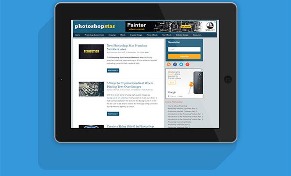
In this Photoshop tutorial, I will show you how to create a realistic-looking iPad mockup from scratch.
As a designer, knowing how to professionally present your iPad app or mobile web design mockup is an important skill. This tutorial walks through all the steps of creating an iPad mockup. Below you can see what the finished version will look like.
Final Image

Tutorial Details
Program: Adobe Photoshop CS6 (CS3+ versions will work as well)
Estimated Completion Time: 60 minutes
Difficulty: Intermediate
Step 1
Open up a new Photoshop document with the width at 4000 px and the height at 3072 px. Select the Rounded Rectangle tool and create a shape with the dimensions shown in the image below.
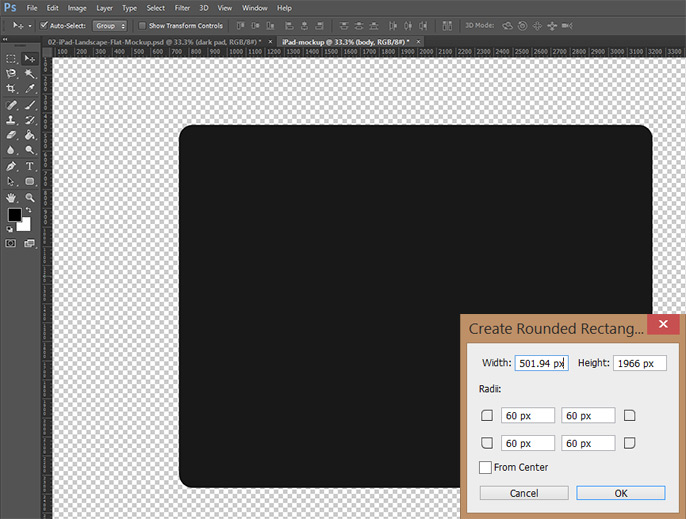
This is the base of the iPad.
Step 2
Next, we are going to add a slight stroke around the body. This will soften the hard edges of the shape and give it a more realistic effect.
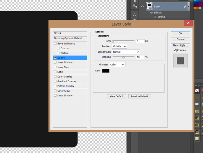
The stroke is very subtle but worth the effort later on.
Step 3
The next step is to create the silver rim that wraps around the base of the iPad. Simply duplicate the body shape and change the color to #b4b8bb, which is a silver-gray color. Using the Transform tool (Keystroke Cmd/Ctl + T), enlarge the gray body by a few pixels on each side. See below.
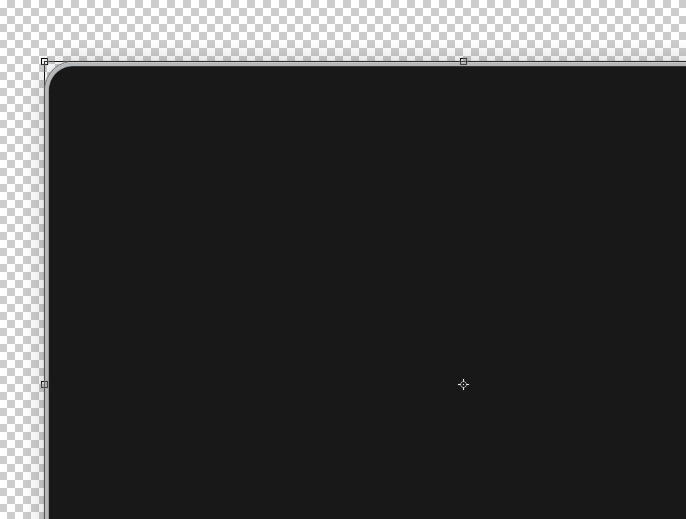
This silver layer becomes the rim around the iPad.
Step 4
We are now going to add the Layer Styles for this silver shape. The first Layer Style we will add is a Bevel & Emboss.
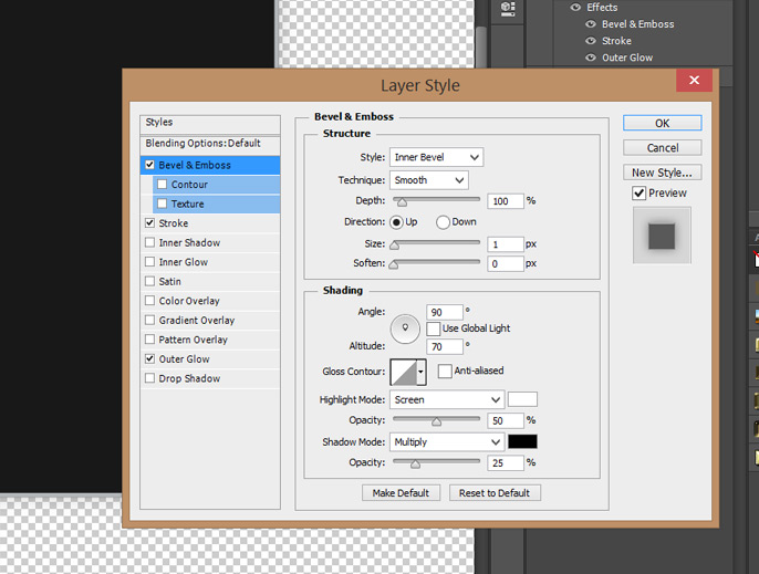
Followed by a Stroke…
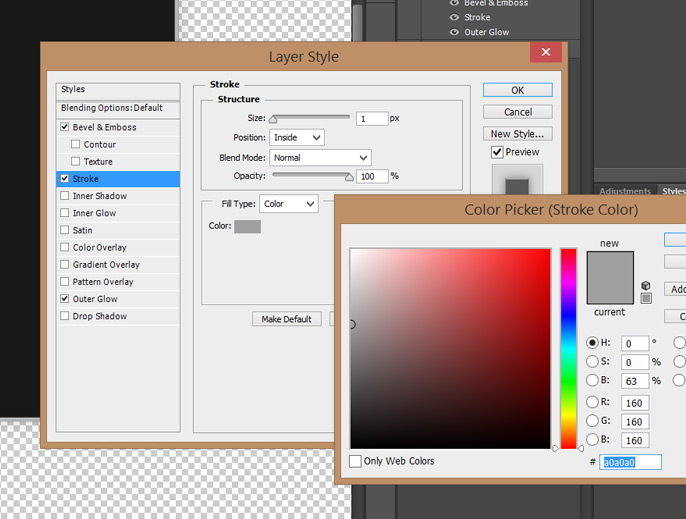
And finally by an Outer Glow.
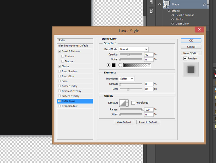
For best results, match the Layer Style settings exactly.
Step 5
The next thing to create is the glare for the iPad screen. We will create a white Rectangle shape and flip it on side by using the Transform tool (Keystroke Cmd/Ctl + T). Make sure the shape covers the iPad from end to end.
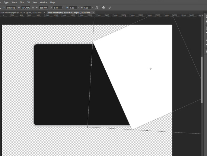
Make sure the shape covers the iPad from end to end.
Step 6
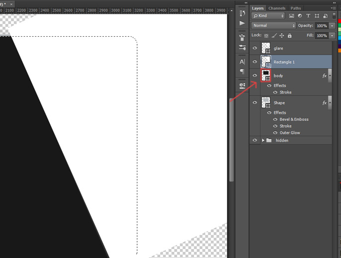
We are now going to add a layer mask to the glare layer so that it only appears on the iPad. Holding down the Cmd/Ctl, click the shape in the Layers panel. See image below. After the pixels are selected, add a layer mask to the glare layer.
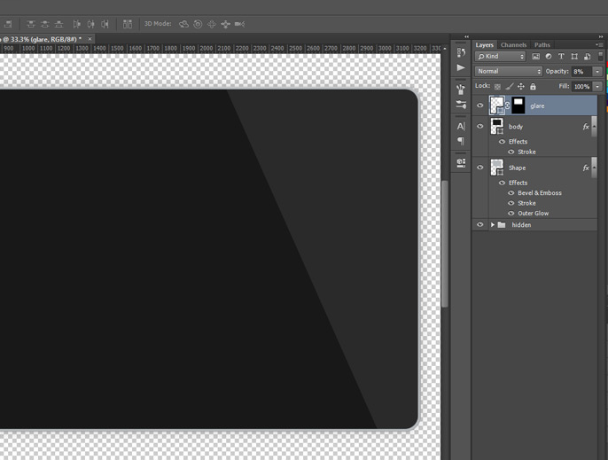
Reduce the opacity of the glare layer to 8% and this will be the result.
Step 7
The next thing we are going to add is the screenshot of the website. We are going to place this image as a Smart Object, which will allow us to go back and edit the screen of the iPad whenever we want. If you want to learn more about Smart Objects, read this article.
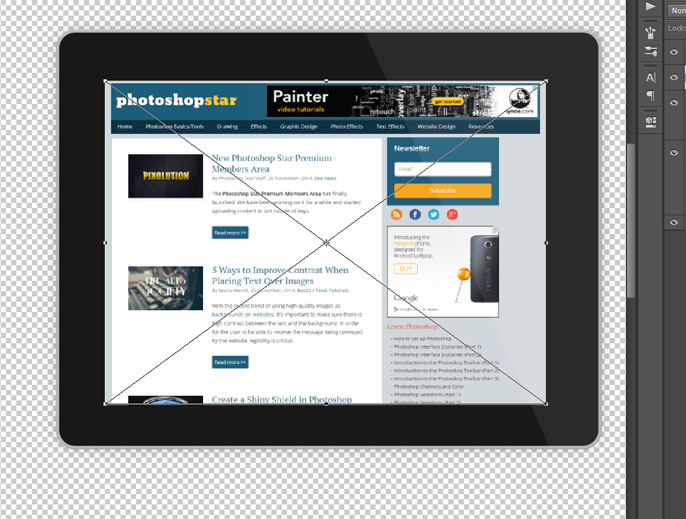
Resize the Smart Object to fit into the iPad screen.
Step 8
A few Layer Styles will now be added to the Smart Object.
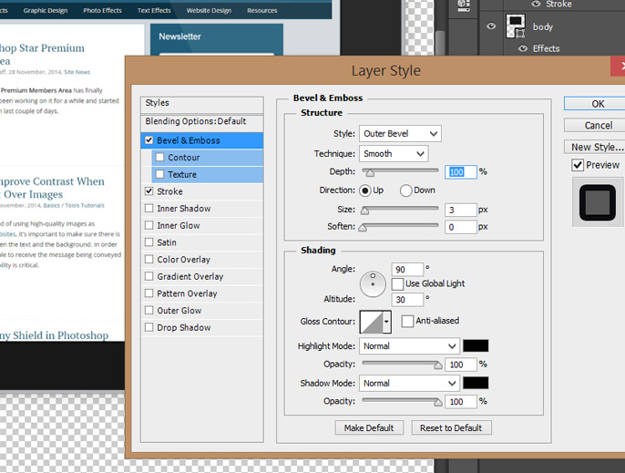
First, add a Bevel & Emboss.
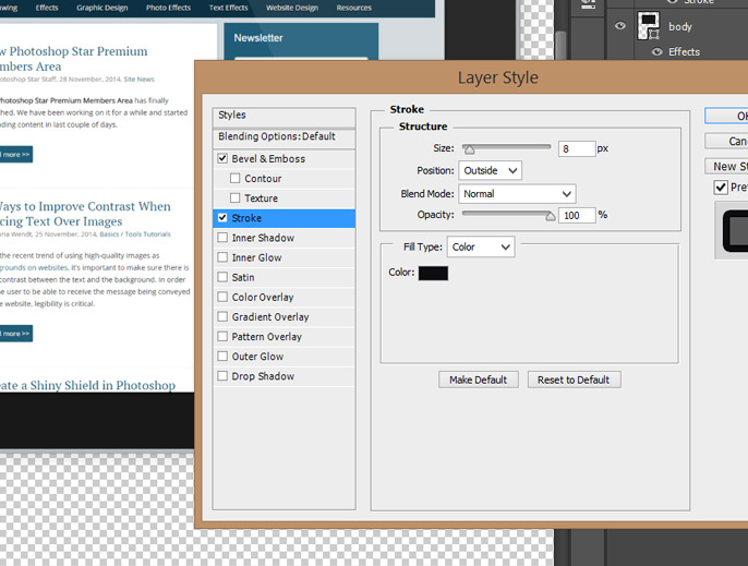
Then, add a Stroke.
Step 9
We are almost done with the iPad, we just to have to add the camera and the Home button. We will tackle the camera first. Start by creating a small circle with the Ellipse tool. Fill the color with #000000 and add a Drop Shadow.
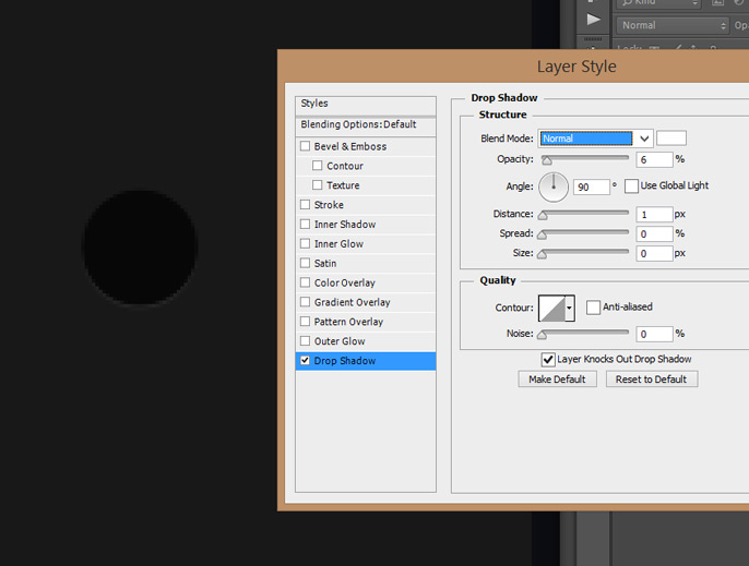
Step 10
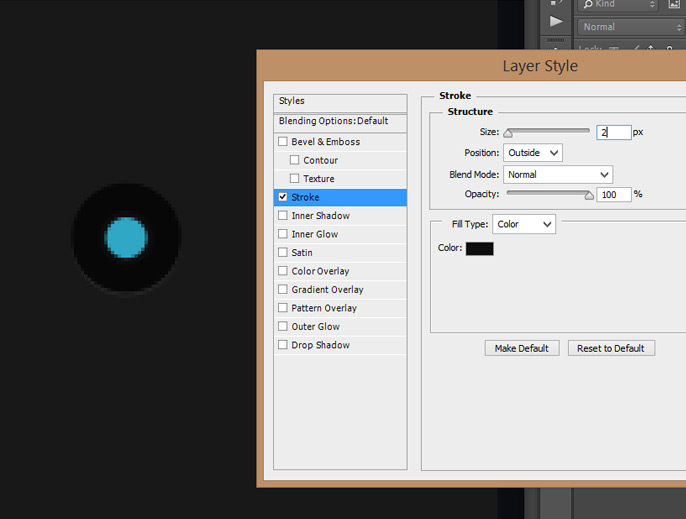
Next, add a small blue circle with the color #30a7c4. Add a slight Stroke Layer Style.
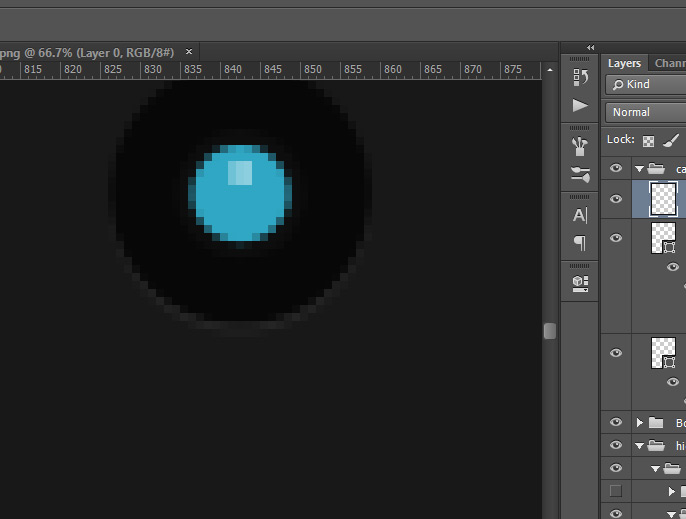
Finish the camera by adding a very small light-colored shine to the blue circle.
Step 11
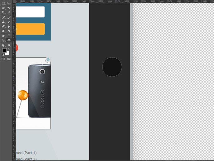
We are now going to create the Home button. Create a small circle and fill it with #000000.
Step 12
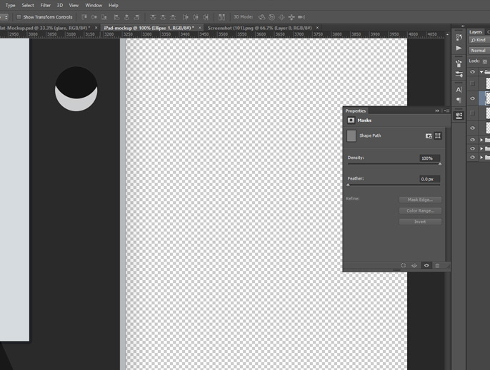
Next, add a small glare to the home button using the Ellipse tool.
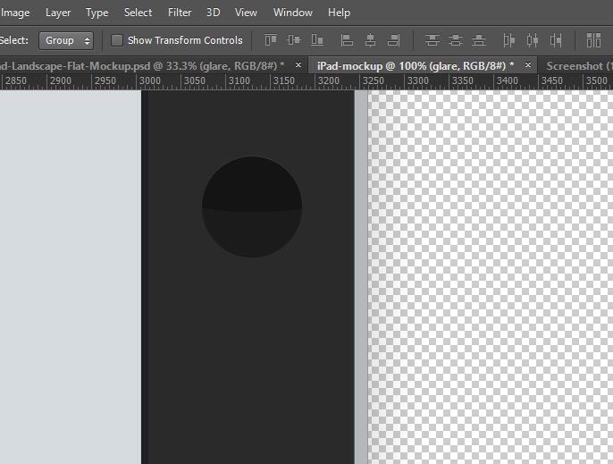
Reduce the Fill to 4%.
Step 13
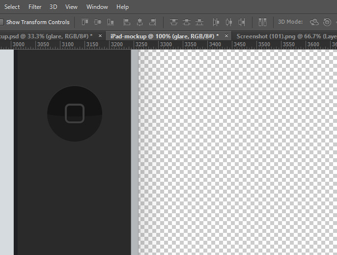
Add a little Rounded Rectangle shape and reduce the fill to give it a transparent look.
And We’re Done!
Your iPad is now finished!
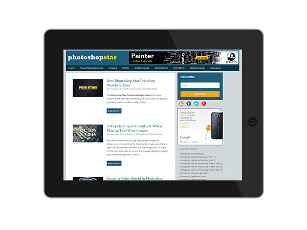
Add some shadowing and a background and you have this!
