
With the recent trend of using high-quality images as backgrounds on websites, it’s important to make sure there is high contrast between the text and the background. In order for the user to be able to receive the message being conveyed by the website, legibility is critical.
Below are five ways to improve contrast when placing text over images.
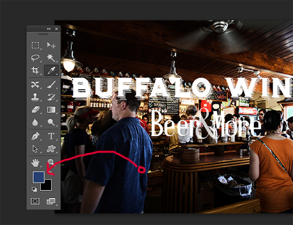
1. Color Overlay
As we can see in the Before image, the text is fairly difficult to read because of how distracting the background is. There are countless details, especially around the menu area. The beautiful texture of the “Buffalo Wings” font is completely lost because of how cluttered the background is. There is certainly room for contrast improvement in this image.

The first step is to create a new layer and and rename it to “color-overlay”. Choose the color selector tool (Keystroke I). Pulling color from the man’s shirt, fill the new layer with color. (Keystroke Combination Shift + F5).
Finally, set the opacity of the layer to 50% and drag the layer below the text.
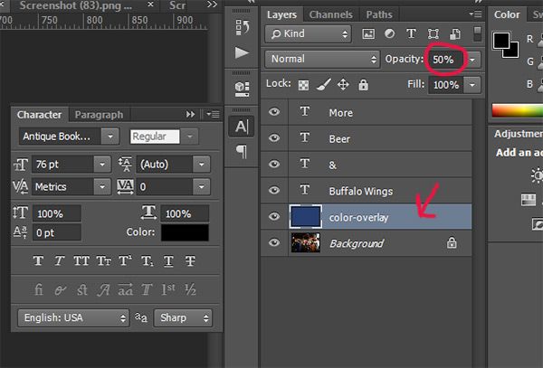
As we can see, the contrast is greatly improved. The texture of the “Buffalo Wings” font is pushed to much greater prominence and is much more visible.

2. Drop Shadow
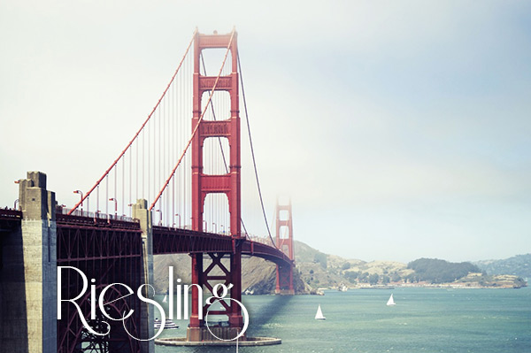
In this scenario, we have a client that requested a thin, weak font over a highly-detailed area of photo. This is an undesired situation because of how difficult it can be to obtain sufficient contrast between the image and the text.
The first step would be to choose an appropriate color for the text.
Clearly, in this case, we want a lighter colored font, preferably white.
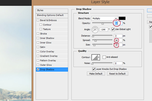
The next step is to add a new layer style and choose a drop shadow. Set the opacity to 52%. Adjust the Spread to 16% and the Size to 10px. The angle should be somewhere close to -144 degrees.
Simply by adding a drop shadow, the contrast is greatly enhanced.
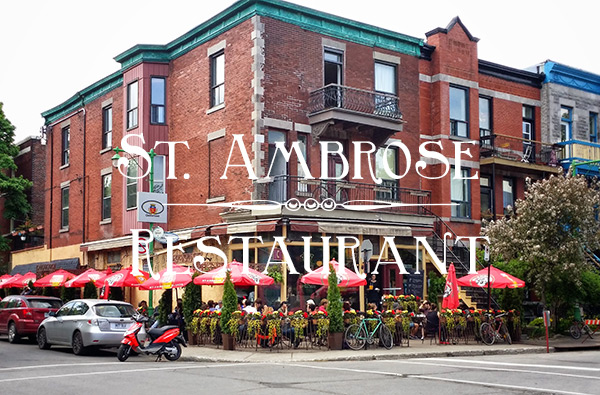
3. Lines
This is one of the easiest ways to improve contrast. Simply adding two whites lines above and below the message gives a better separation between background and text.

Adding the two lines…

…gives a much better distinction between the two design elements.
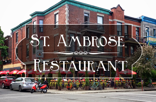
4. Shape Block
Another way to improve contrast is to add a faded-out shape behind the text. It’s a little hard to describe, so I’ll just show you.
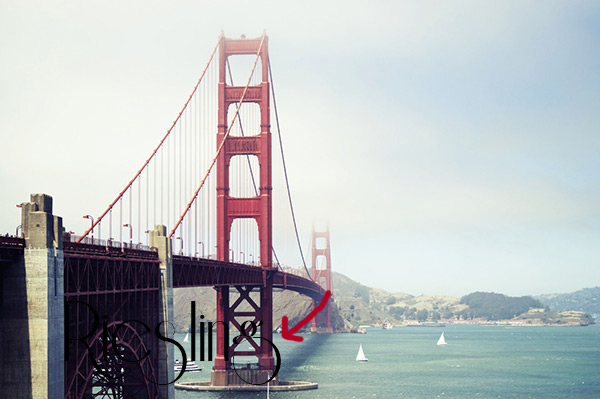
As we can see here, the image initially has little to no contrast. The text is very hard to make out and the divider is almost lost in the building’s details.
In order to increase legibility, use the Custom Shapes Tool (Keystroke U) and create a shape. It can really be whatever you choose, there is no right or wrong shape.
Fill the shape with black and set the Stroke at White and 3pt.
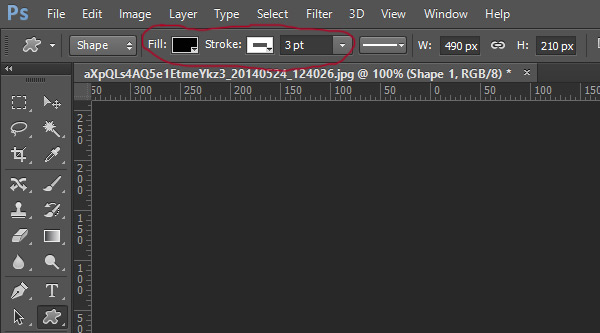
Drag the shape below the text and divider layers and set the layer Opacity to 57%.
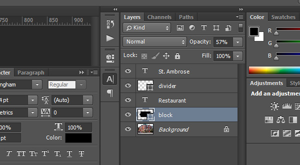
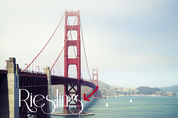
The end result is much more professional and a lot easier to read.
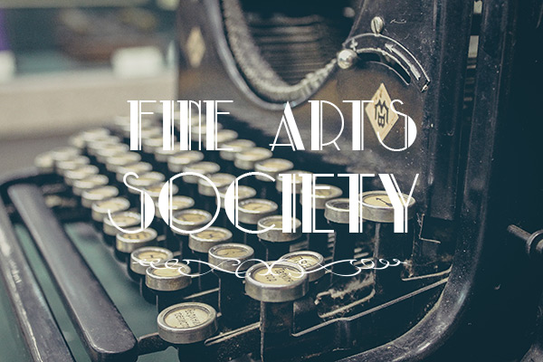
5. Blurring the Background
The fifth and last way to improve contrast is by blurring out the background slightly.
Initially, the text is hard to distinguish from the background.
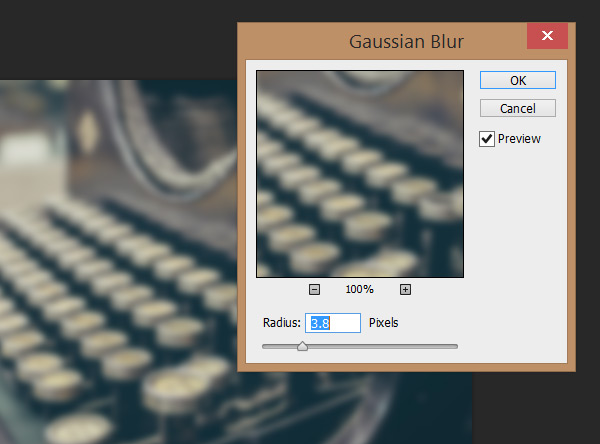
The first step is to convert the background image to a smart object. Simply right click and select ‘Convert to Smart Object’.
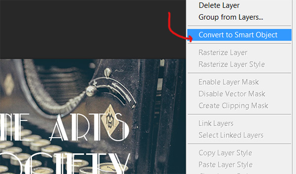
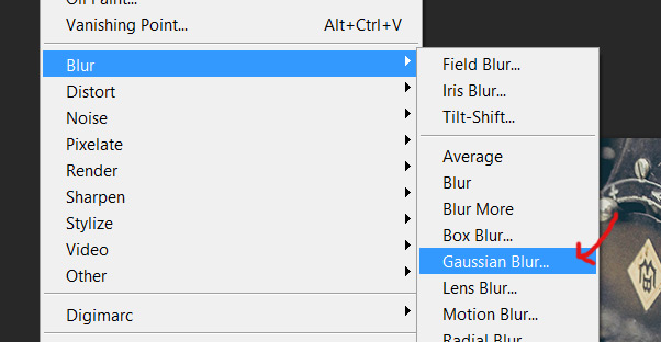
Go to Filters/Blur/Gaussian Blur.
Set the blur radius to 3.8 pixels.
The contrast is now greatly improved and the text can clearly be read.

I hope you enjoyed this tutorial! Please feel free to ask any questions you may have – I’ll be monitoring the comments.