In this tutorial I’m going to be showing you an easy way to make some pretty simple, but nice and glossy navigation buttons, just like the ones below!

1. New Document/Canvas
First of all let’s create a new document in Photoshop. For this tutorial I’m using a very small size of 400 x 100 pixels, with all of the default settings.
2. Create Button Shape
Create your button shape by using the Rounded Rectangle Shape Tool, then apply a gradient inside of your shape/selection. The colors I used here were #6c7c84 and #5a676d.

3. Applying Layer Styles/Effects
Alright, let’s add some details to the button. Start by right-clicking the button layer in the layer’s palette and going into Blending Options. Click and apply the following settings:
And now you should have a button like this:
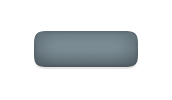
Looking alright so far?
4. Add Shine/Highlight
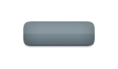
Create a new layer (Layer > New > Layer…) then select your main button layer’s pixels by holding ctrl and clicking the layer’s thumbnail. O your new layer draw a White to Transparent gradient from the top of the button to the bottom.

Cut your newly-made gradient in half by using the selection tool.

Change the layer mode for your shine layer to Soft Light and lower the opacity to around 25-40%.
5. Finishing Touches
Again, create a new layer, now select the main button layer’s pixels, again. Contract the selection by 1 pixel (Select > Modify > Contract) and fill the selection with white. Contract the selection by another 1 pixel then press delete.
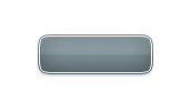
Using a large, soft brush, erase away the bottom half of your inner stroke. Change the layer mode for this layer to either Overlay or Soft Light, and lower the opacity to around 80-100%, if necessary.
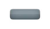
Using these same methods, make an inner stroke for the bottom half of the button, maybe even use a dark color instead of white.
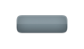
6. Add Text
Now you just need to add some text to your buttons, which you should normally do when making these buttons for your website (using HTML and CSS). For my text I’ve used used Tahoma, 12pt, bold. I also finished by adding a simple Drop Shadow layer style to the text.

Thanks for reading this tutorial, I hope you enjoyed it! If you would like to learn how to make these buttons into HTML/CSS, you can check out a few of the below websites:
🙂
