This simple Photoshop tutorial will walk you through the creation of a simple, but cool navigation bar and buttons that you can use on your website!

1.
First of all, create a new document and fill the background with a dark gray. (my document is 430 x 130, and my background color is #161616)

Empty image, oh yeah! 🙂 Make a new layer then make a selection sized around 400 x 34, fill the selection with #393939.

Apply this following Gradient Overlay.

Make a new layer and select the bar again, fill the area with a nice pattern.
(note: click the word pattern above to be taken to the pattern image)

Change the layer opacity of this pattern layer to 30%.

2.
Make a new layer again and with the Rectangular Marquee Tool make a set sized selection of 300×26 in the middle of the main bar.

Fill this selection with #161616.

Apply the following layer styles:

3.
Now what you need to do is create a selection 1 x 26, or just draw a line from the top of the 2nd bar to the bottom with the pencil tool. You can use any color.

Apply the following Gradient Overlay.

Duplicate the ‘indent’ layer and move it around 81 pixels to the right. (press the right key once, then hold shift and press the right key 8 times)

Repeat that step once to the left, then maybe again. I ended up with 4 indent lines, I merged them all and centered them.

After you’ve merged the layers together, lower the layer opacity to around 50%.

4.
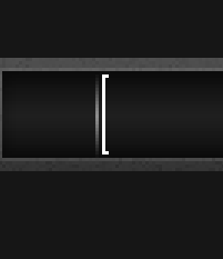
Make a new layer and zoom in on the left corner area, make a shape like so next to the left indent line (using the pencil tool):

Duplicate this layer, flip it horizontally and move it to the left side of the next indent line.

Merge these layers together then duplicate it, move it into the middle.

Do the same again and move it to the right.

Merge all these layers together and change the layer mode to Softlight and the opacity to 50%.

5.
Make a new layer then get the Gradient Tool, using these options:
![]()
Make a gradient in the bottom middle sort of area:

Set the layer mode to Overlay and the opacity to 40%

Now you can add text! 🙂

Above I used:
- Tahoma
- 12pt
- No Anti-Aliasing
- #f6dc00
I also applied this Drop Shadow to my text layer.
That’s it:

Thanks for reading this Photsohop tutorial, everyone. I hope you enjoyed it, and even learn something!
