Sorry, but yet another text effect tutorial! 🙁 I just can’t seem to think of any other ideas lately, feel free to leave a message in the comments if you have any ideas! Anyway, in this nice ‘n’ simple tutorial I’m going to be showing you how to make a “Butter Scotch” text effect 😛 Like the one shown in the image below:

1. Getting Started – Canvas/Background
Now, firstly, you’ll have to create a new document in which you can make this text. For this tutorial I’m simply going to be using a small size of 400 x 180 pixels with the default resolution (DPI) of 72. But if you were making this for print, you’d want to use at least a few inches in size and at least 300 DPI/Resolution.
After creating your document, add in a suitable background. I used a background gradient of #ffa714 and #e77302, then added in a few shapes with the same colors and lowered the opacities of the layers. I ended up with this for my background:

I finished the background off by applying Filter > Render > Lighting Effects using the Omni Light Type and I also applied Filter > Noise > Add Noise with an Amount of about 2.0.

Reminds me of honey, yum! 😛
2. Write out your Text
Alright, time to write out your text. I’ll just be using the font called Georgia for this tutorial, which is quite a nice font that comes with Windows.

I bet you want to know what settings I used for the text above, don’t you? 😀 For the word “Butter” I used the following settings: Georgia, 48 pt, Bold, #ffffff, -60 tracking, All Caps. And for “Scotch” I used: Georgia, 60 pt, Bold, #9c4907, -40 tracking, All Caps. If you don’t know what some of those settings are, you can view the settings below.
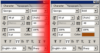
3. Giving Effect to Your Text (Layer Styles)
Now it’s time to give your text some life by adding layer styles. To add a layer style, right-click the layer in the layer’s palette and go to the Blending Options. To the white text I only added just two layer styles, which where:
Now your text should look pretty much like this:

I then added these layer styles to my “Scotch” text layer:
Now you should have a nice and shiny look like this:

Mmm shiny 🙂
4. Adding Perspective to Text
To give the text more feel or whatever, you might want to add some cool perspective to the text. I’m not sure what version of Photoshop you need to for this feature to be enabled, but it’s called ‘Create Warped Text’.

Click the warp text tool and change your text to your liking! I used the settings shown below for both of my sets of text:
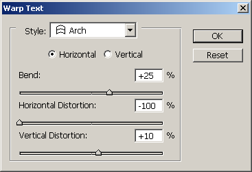
If your text doesn’t line up properly, you may want to rotate one of the sets of text so it lines up correctly. Now you should have something like this:

You might want to experiment with different filters and layer styles and all that to get some unique outcomes, you just have to get creative! Well, that’s just about it for this tutorial… I hope I didn’t miss anything out!
Thanks for reading everyone! I hope you enjoyed this simple tutorial 🙂
