In this quick Photoshop tutorial we’ll be recreating the ‘Bee movie’ text effect, you know, the one you’ve seen all over the place over the last few months? 😛
You can see what we’ll be designing with this tutorial in the below image.
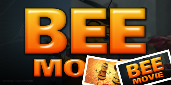
You can see the original text over at the Apple trailers page.
1. Background Creation
Firstly we’re going to make a nice background. Start by creating a new document in Photoshop, all the default settings except dimensions: 600 pixels width, 300 pixels height.
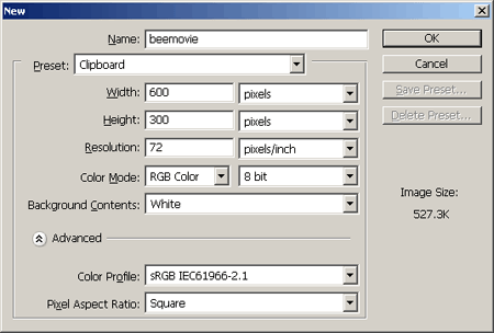
After making your new document, fill the background layer with black then make a light gradient in a new layer.
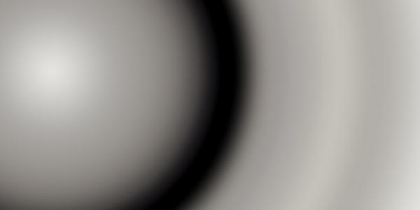
Now you’ve got two layers, the background layer and your gradient layer, change the opacity for your gradient layer to about 5-15%, so that you end up with a very dark background again.

Now, you can finish off the background by adding in a screenshot of the Bee movie or like that. For this I went to Google Images and searched for an extra large picture of ‘bee movie.’ I found this image. If the that site is down, download here.
Copy the image you’ve chosen to your document and resize it to fit. After this, change the layer opacity to around 15-25%, duplicate your screenshot layer and change the layer mode to either Overlay or Soft Light.
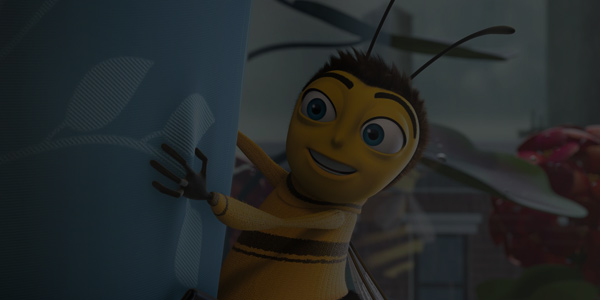
Now you should have a background like this.
Lastly for your background, create a new layer and draw a black to white linear gradient on your canvas, black at the bottom and white at the top, similar to this:

Change the layer mode for your gradient layer to Multiply and you’ll end up with an effect like this:
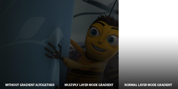
What do you think? Well, at least we’re done for the background! 🙂
2. Create Base Text
Alright, time to make our base text. What you need here is a very,very fat font. Head over to DaFont or UrbanFonts and see if you can find a nice, large sans-serif font.
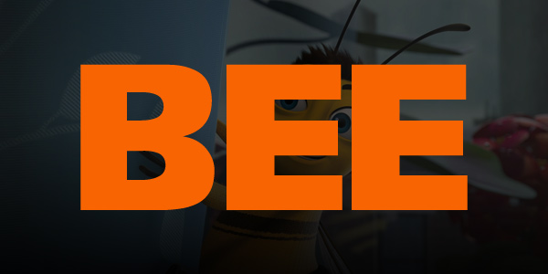
In the above image I’ve used a font called Frutiger 95, which is sadly a commercial font. Feel free to try a different font such as Arial Black, or you know, buy or ‘get’ a nice font from somewhere. 😉
Note: Since we’re working in a fairly large document size, you will want to use a large text size, around 150 pt or whatever suites the document size.
3. Apply Layer Styles to Text
Now, to make our text look like the real thing, we’ll add some layer styles.
Colors used were:
- Inner Glow: #7f7f51.
- Gradient Overlay: #f86503 and #fbe432.
And now we have something like this:
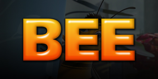
Looks pretty much finished already, huh? 🙂
Please note: The layer styles depend on what size your text is, the size of the bevel may need to be adjusted for smaller or bigger text, please remember this.
4. Small ‘Movie’ Text
The last thing we really need to do is add ‘Movie’ underneath the main text, but in a smaller font size. You can simply duplicate your main text here, size it down and change the letters, but the layer styles will actually need a little tweaking.
After duplicating your main text and changing what needs to be changed, position your text accordingly, like mine:

Now, apply/edit the following layer styles/settings:
Alright, now, hopefully your text looks something like this:

If it does, then congratulations!
Thanks for reading this tutorial everyone, I hope it was alright by your standards!
