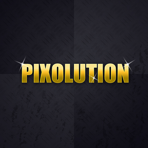
This Photoshop tutorial explains how to make a simple gold text effect by using some layer styles, namely the Gradient Overlay layer style!
Final Image Preview

Resources
- 9 tileable metal textures (starnetblog_tileable_metal_texture8.jpg)
- Grungy Brush package
- Highlight Glint or Star Sparkle Brush Set
Step 1: Setting the Stage
Let’s start by making a new document in Photoshop. I created a new document sized 500 x 500 pixels with all the default settings, RGB, 72 DPI, etc.
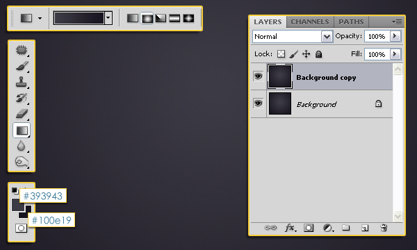
After creating your document, set the Foreground color to #393943 and the Background color to #100e19, then fill the Background with a Radial Gradient.
Duplicate the Background layer (Ctrl+J).
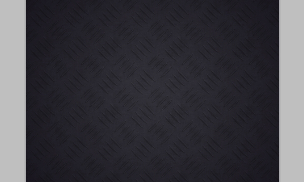
Double click the “Background copy” layer to apply a Pattern Overlay layer style. Change the Blend Mode to Multiply, the Opacity to 70%, and the Scale to 25%. Use the starnetblog_tileable_metal_texture8.jpg image from the 9 tileable metal textures pack, (it is also the second pattern in the .pat file), as the Pattern.
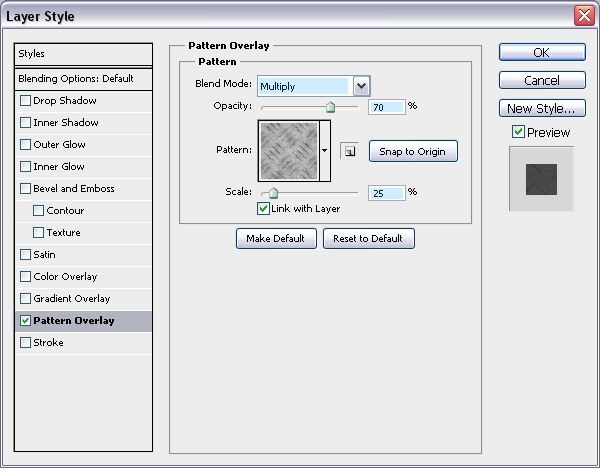
You can play around with the values, for example, other good layer modes to use in this case are Soft Light, Vivid Light, and Color Dodge. You can as well choose different patterns, but you might need to adjust the Scale value if you do so.
Get out the Rectangular Marquee Tool. Click the Add to Selection icon in the Options bar at the top, and set the Style to Fixed Size, then type 50% in both the Width and Height boxes. Drag your selection onto the canvas then into the bottom right corner of your canvas, do the same but in the top left corner.
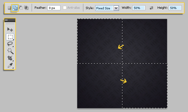
Create a new layer on top of all layers and call it “Dark Squares”, and fill the selections with the Background color (#100e19). Go to Select -> Deselect (or press Ctrl + D) to get rid of the selections.
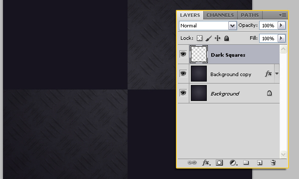
Lower the Opacity for this layer to 25%.
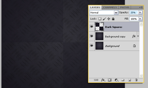
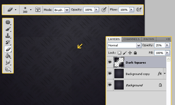
Use a large soft brush to erase away the center (middle area) of the squares, so you get something like this:
Create a new layer on top of all layers and call it “Light Squares”. Repeate the previous steps to create two more selections in the empty corners, and this time use the Foreground color (#393943) to fill the selections.
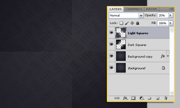
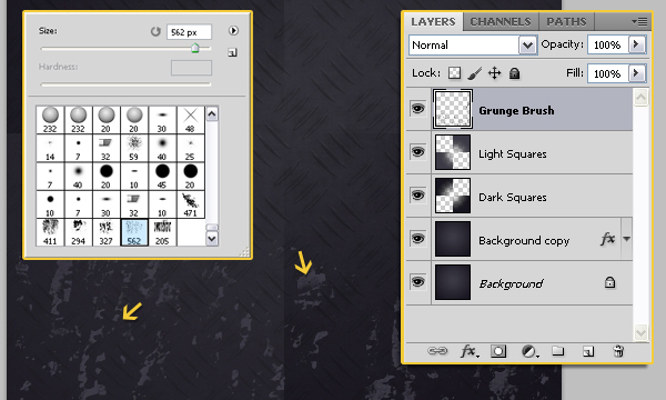
Create another new layer on top of all layers and call it “Grunge Brush”. Use the brushes from the Grungy Brush package to add a bit of grunge at the bottom of the document, using the Foreground color (#393943) as the brush color.
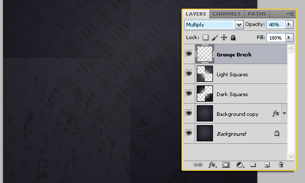
Change the layer’s Blend Mode to Multiply and lower the Opacity to something around 40%.
Step 2: Setting Up your Text
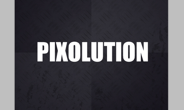
This is the easy part. Get out the Horizontal Type Tool (T) and write your text in whatever color you want. The font used is Impact, and the size is 80px. You can use any other font you like, bolder fonts give a better result.
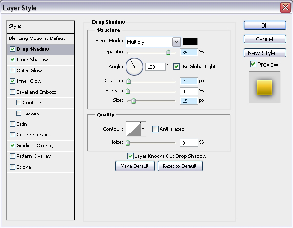
Double click the text layer to apply the following Layer Styles:
– Drop Shadow: Change the Opacity to 85%, the Distance to 2, and the Size to 15.
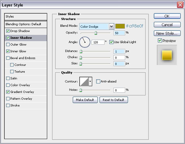
– Inner Shadow: Change the Blend Mode to Color Dodge, the color to #a98e0f, the Opacity to 50%, the Distance to 1, and the Size to 0.
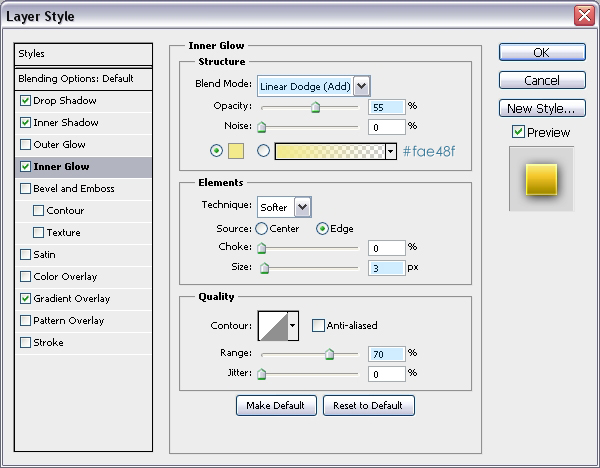
– Inner Glow: Change the Blend Mode to Linear Dodge, the Opacity to 55%, the color to #fae48f, the Size to 3, and the Range to 70%.
– Gradient Overlay: Check the Reverse box, and change the Scale to 55%.
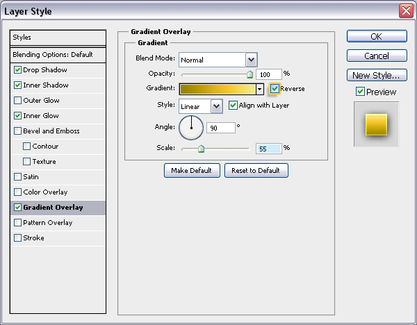
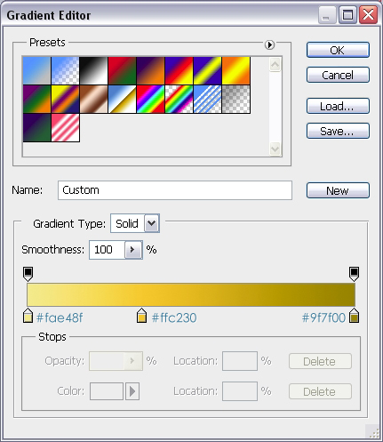
Click the Gradient box to create the gradient using the colors #fae48f, #ffc230 and #9f7f00. Position the color stops as shown below:
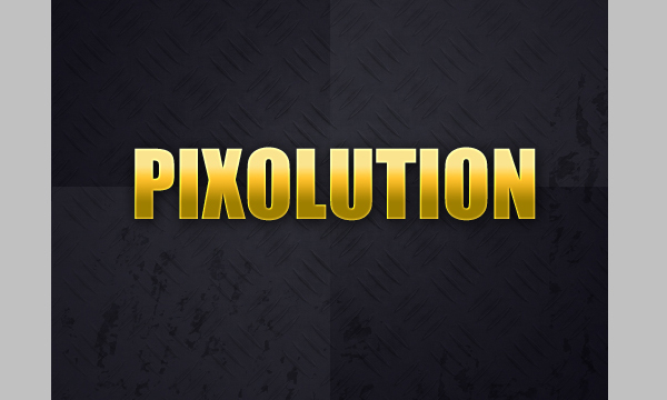
This is how your text should look like after applying the Layer Styles:
The last thing we’re going to do is adding some sparkles! So create a new layer on top of all layers, set the Foreground color to white, and use a sparkles brush to create some sparkles around your text.
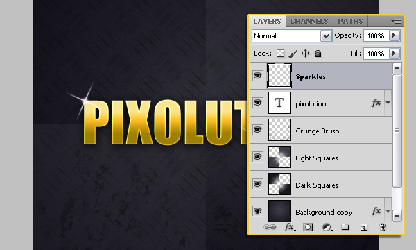
Final Image
And that’s it! This is what your text should look like:
