In this Photoshop tutorial we will study the blending modes belonging to the Lighten Group.
Tutorial Details
- Program: Adobe Photoshop CS6 (CS3+ versions will work as well)
- Estimated Completion Time: 50 minutes
- Difficulty: Intermediate
Resources
Setup working area
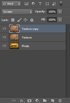
In this article we will talk about the Lighten group that is composed of: Lighten, Screen, Vivid Light, Linear Light, Lighter Color. We will work with 2 images, a photo and a texture and we will change the blending mode of the texture to look at the effects.
Photo:
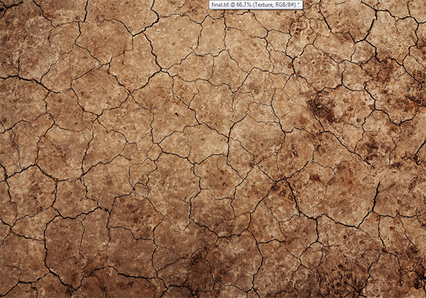
Texture:
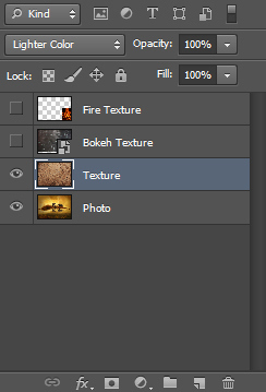
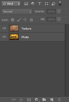
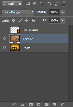
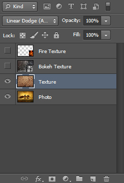
Layer window:
Lighten
“Looks at the color information in each channel and selects the base or blend color—whichever is lighter—as the result color. Pixels darker than the blend color are replaced, and pixels lighter than the blend color do not change. “
This blending mode is the opposite of Darken. If the pixels of the blended layer are lighter then the composite pixels below then they are kept, otherwise they are replaced with the lighter composite pixels below. This behavior occurs on a channel by channel basis.
Here’s how the texture set to lighten looks:

Screen
“Looks at each channel’s color information and multiplies the inverse of the blend and base colors. The resulting color is always a lighter color. Screening with black leaves the color unchanged. Screening with white produces white. The effect is similar to projecting multiple photographic slides on top of each other.”
This blending mode is like Multiply only instead of darkening the image it lightens it up by boosting already present light pixels. Remember the analogy with transparent paper I told you to better understand Multiply. Well, to better understand this blending mode imagine a projector that projects an image on a white wall. Now imagine that another projector projects another image (could be the same one) on the exact location where the first projector is projecting. The result will be a lighter image. Adding another projector (or layer with Screen blending mode ) will further increase the overall luminosity of the image.
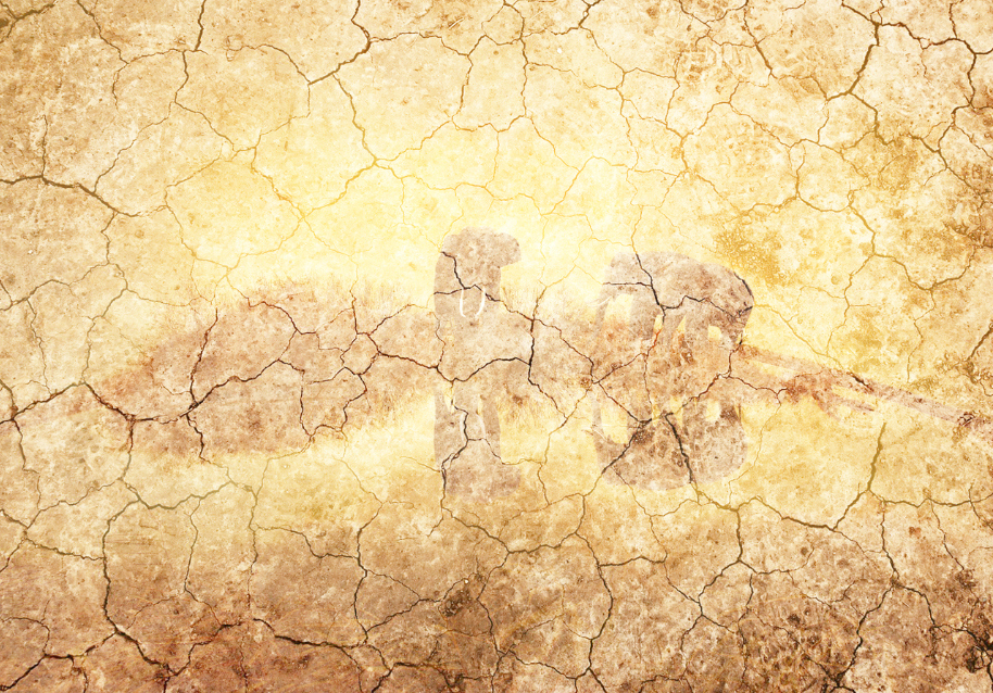
This is a very useful blending mode. Here’s how our texture set to Screen looks:
Note how the image got lighter.
Now let’s duplicate the texture layer (Ctrl + J) – and we will have the texture layers set to Screen blending mode:
Notice how the image gets even lighter. Delete the duplicate texture layer (Delete).
Let’s see what we can do with this blending mode. First let’s turn off the visibility of the texture layer and duplicate the photo layer by pressing Ctrl + J. Now change this layer’s blending mode to Screen and apply a 5-10px Gaussian Blur:
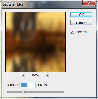
Notice how the image got a nice glowing, dreamy look. This works very well with wedding photographs or if you want to convey an angelic, out of this world feel to your image.
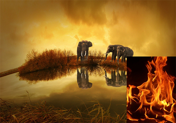
Another thing I use the Screen blend mode extensively for is my photo manipulations when I want to instantly get rid of the black background. A very frequent situation is when I want to place a fire effect on my image but I don’t want to bother selecting the flames from the background.
Look how the fire texture looks with normal blending mode:
And how it looks when I change its blending mode to Screen:
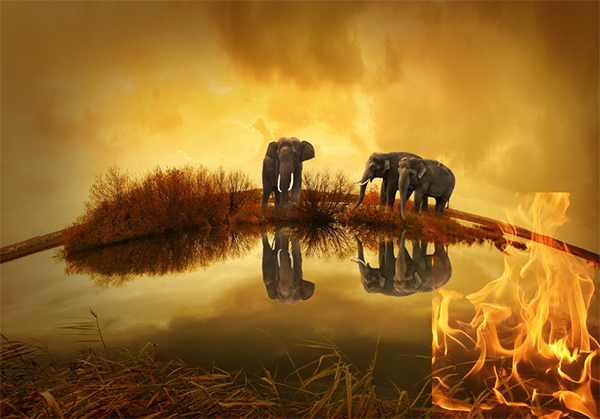
Note how the black background disappears and we are left only with a nice flame (which we should clean-up in order to properly use it).
Another use for the Screen blending mode is for lightening up a photo in a natural way very quickly.
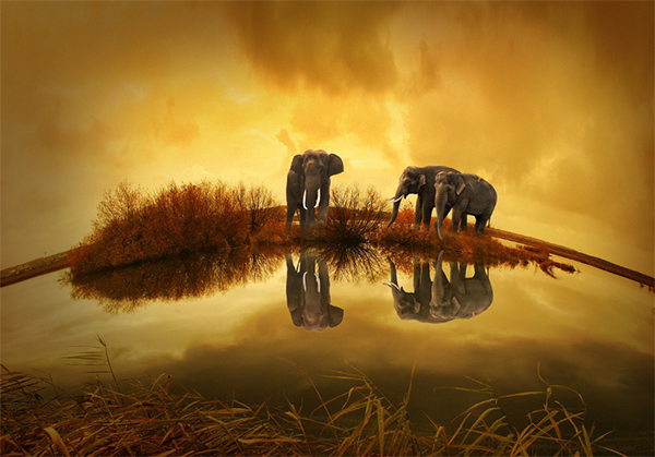
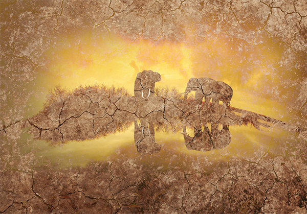
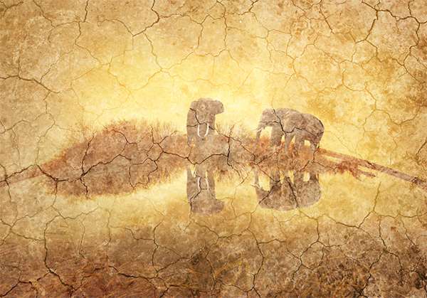
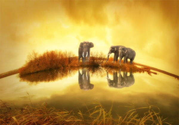
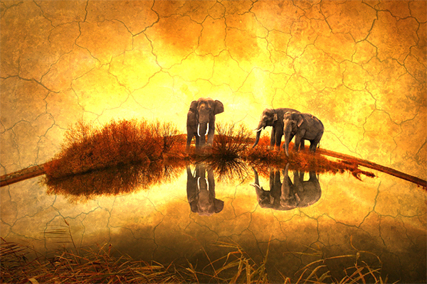
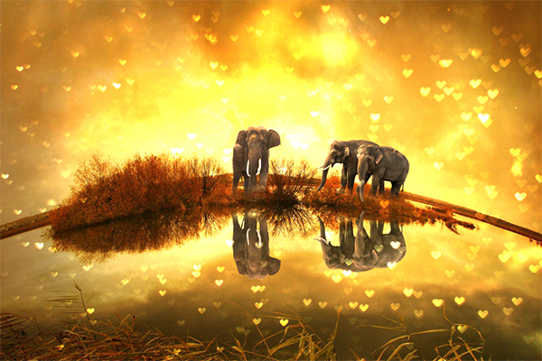
Take a look at my elephant photo below. Notice how it’s quite dark and has muted colors.
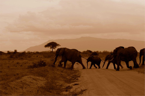
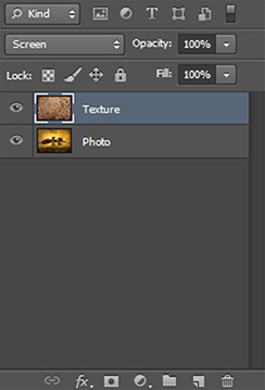
I could apply a Curves Adjustment layer but let’s say that I am in a hurry and I want to quickly lighten up the image. Nothing could be simpler. Simply duplicate the “Background” layer and change its blending mode to Screen:
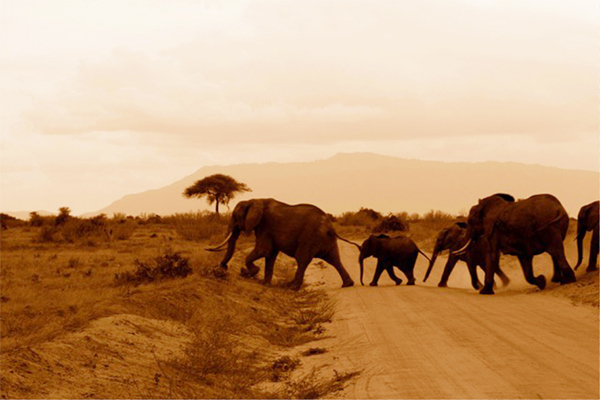
Note how the image looks much lighter and has a nice natural look (no overblown highlights).
Color Dodge
“Looks at the color information in each channel and brightens the base color to reflect the blend color by decreasing the contrast. Blending with black produces no change.”
Color Dodge is the opposite of Color Burn. Has a similar effect to screen only much stronger and it also boosts up the saturation quite a lot. Here’s how our texture set to Color Dodge looks:
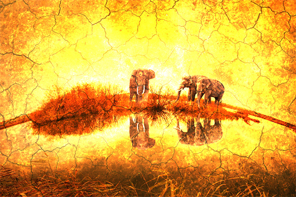
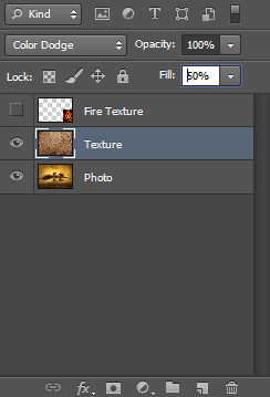
Note the very strong (almost white) highlights and the saturated colors. If you want to tone down the effect you should lower the Fill instead of the Opacity, as Fill better preserves the contrast and the saturation:
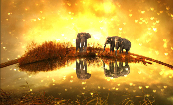
One very common use for the dodge filter is to boost up the light that is already present in order to obtain a pleasant effect. Here’s how to it. Let’s say I have a nice bokeh texture that we have on a layer over our image:
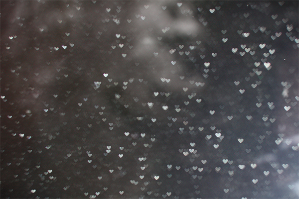
Now look how nice it looks when we change the blending mode to Color Dodge. The bokeh effect simply boosts up the already existing colors so it blends very all with the overall scene. If you find the effect too strong you could lower the the Fill Value:
Another nice use for Color Dodge is to selectively increase lightness in certain areas, especially in photos that are mostly dark with a few pools of lightness.
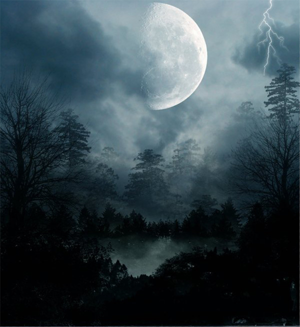
Take a look at our night scene:
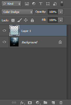
Now create a new layer (Ctrl + Shift + Alt + N) and change its blending mode to Color Dodge. Select the Brush Tool (B) and Alt-click somewhere on the sky to sample a light blue color. Reduce the Brush opacity to 50% and paint over the lake in the middle of the photo and over the trees:
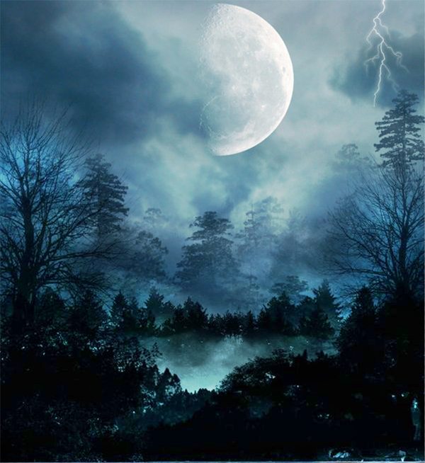
Notice how the already light (but with muted colors) areas get even lighter and also note how when we painted over the dark trees we boosted up only the lightness behind them. This is an effect that looks very nice as it keeps the dark areas unchanged while boosting in a glowing way the light areas behind them (or at least giving that impression).
Linear Dodge
“Looks at the color information in each channel and brightens the base color to reflect the blend color by increasing the brightness. Blending with black produces no change.”
This blending mode is the opposite of Linear Burn. It has almost the same effect as Color Dodge only a bit brighter and with less saturated colors and contrast.
Here’s how our texture with Linear Dodge blending mode looks:
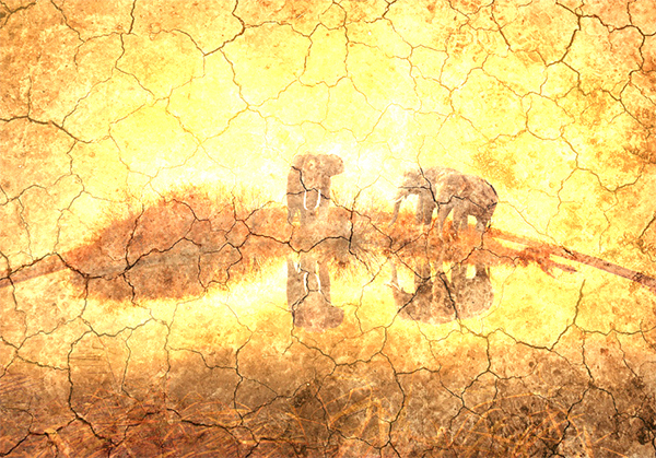
Not the most useful blending mode in the world.
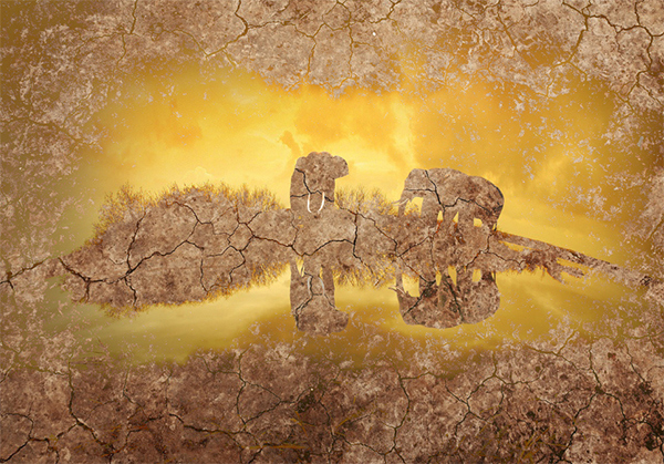
Lighter Color
The opposite of Darker Color. Behaves like the Lighten blending mode but it produces harsher transitions (because it works on a composite channel basis).
Here’s how our image looks with texture layer set to Lighter Color: